As a content creator, I dabble in a lot of different formats, and I try a lot of different tools.
It’s rare that I find one I like so much that I stop looking for anything else. But after playing with Venngage, I’ve reached full stop.
What Is Venngage?

Venngage is a visual content tool that takes the angst out of creating infographics.
They’ve divided the creation process into 3 easy steps:
- Choose a template.
- Add charts and visual.
- Customize your design.
They aren’t exaggerating. It really is that easy.
But I caution you not to limit your thinking when you hear the word infographics. Venngage’s templates give you a starting point for a wide range of visuals:
- Reports
- Posters
- Promotions
- Social media
Just scrolling through the templates sparked a handful of ideas that I’m excited to try.
Creating My Infographic: Fast and Easy
My goal for today was to finish a lead magnet. The outline was done, but writing it was taking longer than I wanted. Not only that, as valuable as the information was, I was worried it would be dry as toast as a text-only document.
So I decided to try laying it out in Venngage.
My document was essentially a list of 10 items. I scrolled through the templates to find one that already had 10 list items.
On a side note, for the first infographic I created in Venngage, I chose a template that had 2 fewer list items than I needed. I was able to duplicate the design elements to create the right number of text areas, and it wasn’t difficult. I just wanted to save myself the trouble today.
Fortunately, I found several designs that would work for a 10-item list. I also found some designs that would have been a more creative approach—as in, they weren’t formatted as a list. Hmmm. That got my creative juices flowing.
The wide variety of layout options will spark your creativity too. In Venngage, you can choose templates for:
- A blank canvas (in case you are a designer)
- Data stories, for sharing dry data in an interesting way
- Year reviews, for presenting business financials and growth
- Blueprints (honestly, they look similar to data stories to me)
- Editorial content, which really caught my attention. They give you a format for laying out your text in a beautiful way.
You can also filter the templates by their category:
- Infographics
- Reports
- Charts
- Social
- Listographics
- Marketing materials
- Communications
Here’s what I finally chose. With its simple layout and plain background, I figured it would be easy to adapt.
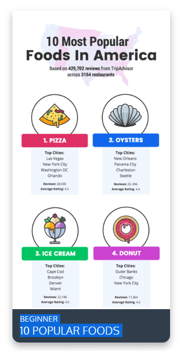
The template I decided to start with.
Now, with my template chosen, it was a simple matter of editing the images and text.
I started by updating the background image in the header. While Venngage does provide a library of images, I chose to upload my own.
You can see the interface here. I uploaded the image, dragged it into the infographic, and moved the image layer behind the text layer. Simple.
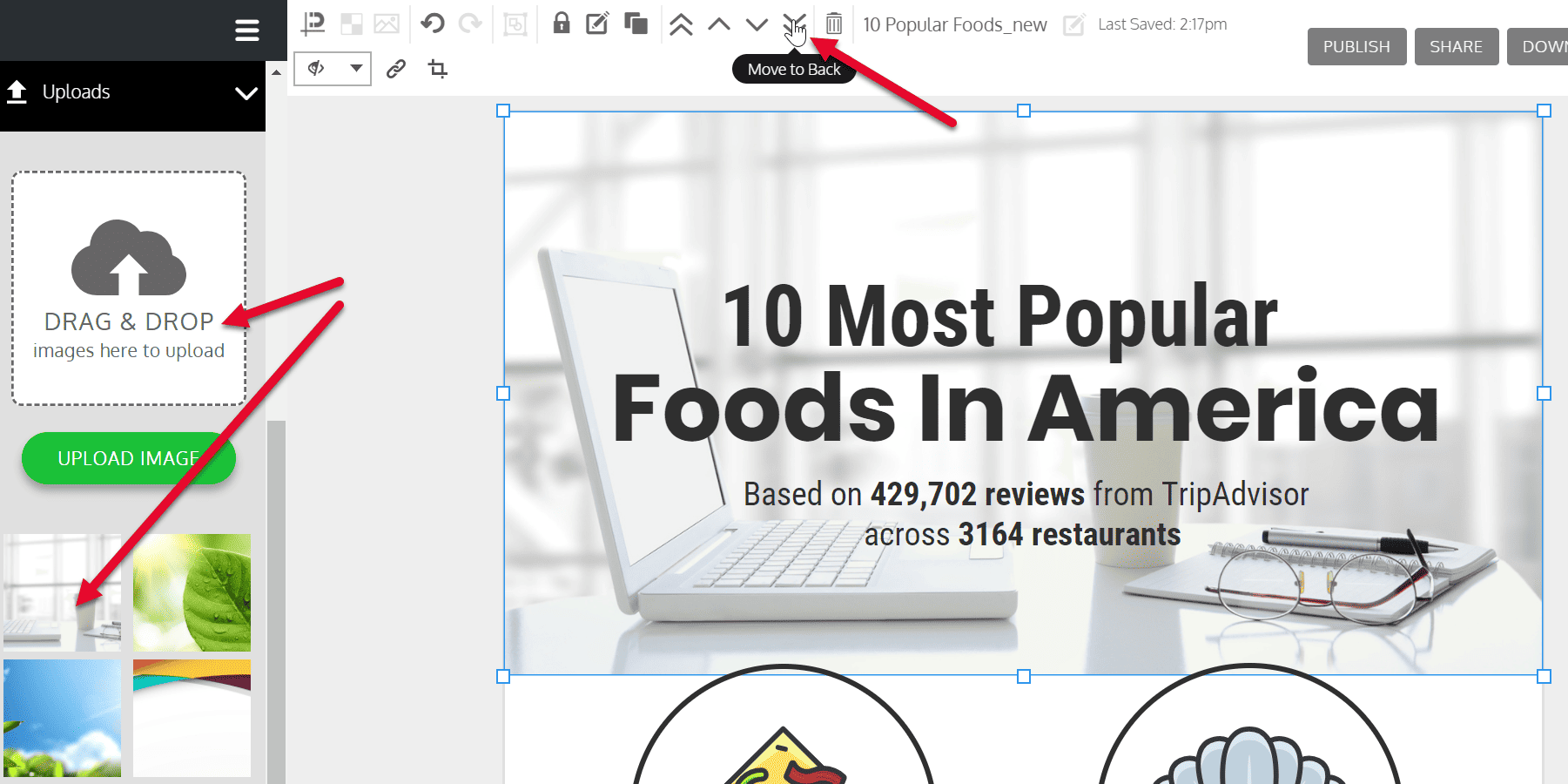
Uploading an image to your infographic.
With that done, I began updating the content.
I changed the title and the 10 list subheads. Then I changed out the icons to fit my topics.
If you’ve used many infographic tools, you know how hard it is to find a good selection of icons and images. I’ve been pleasantly surprised by the wide range of icons in Venngage’s library.
To save time, I used the search option. I typed in a keyword and was presented with some really good options. I was able to find a full-color icon for each of my 10 list items without settling.
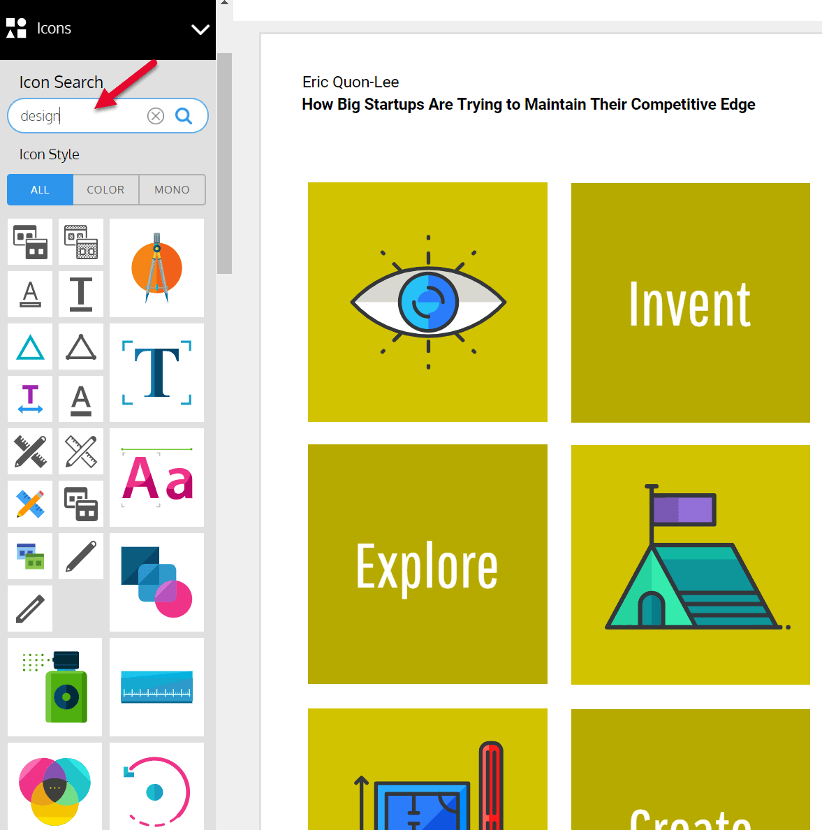
Notice the options you have for icons. (It’s a different template, so don’t let that throw you.)
Then, lastly, I updated the blurbs below each list item. This is the bit that would have taken me several hours in a text document.
If I had chosen to forge on, writing my lead magnet, I’d still be writing, laying out, and looking for graphics. Instead, in only an hour, I had a finished infographic that looked amazing.
The only thing that confuses me is when I’m done. I keep looking for a save button but, apparently, Venngage auto-saves your work, which means there’s no risk of losing a complete design because you forgot to save.
When you’re happy with your design, you can publish your infographic, share it, or download it.
I usually just download a PNG, but today, I also downloaded a PDF. Lead magnet: Done!
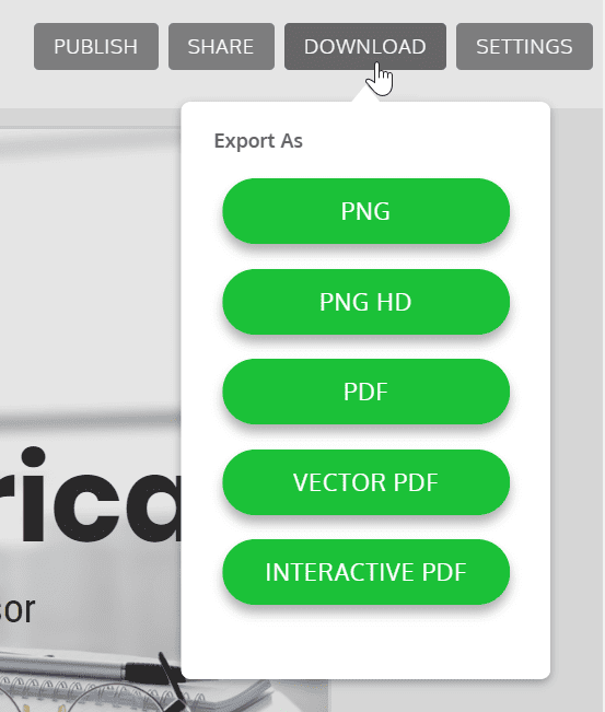
Your options for exporting your finished infographic.
Why I Love Venngage
As I mentioned earlier, I’ve used a lot of visual designers, infographic makers, and presentation tools.
So far, I’ve created 4 designs with Venngage, and every time, it gives me a polished, professional infographic without taking a lot of time or giving me fits.
It’s easy to use. It’s intuitive. And my infographics look amazing.
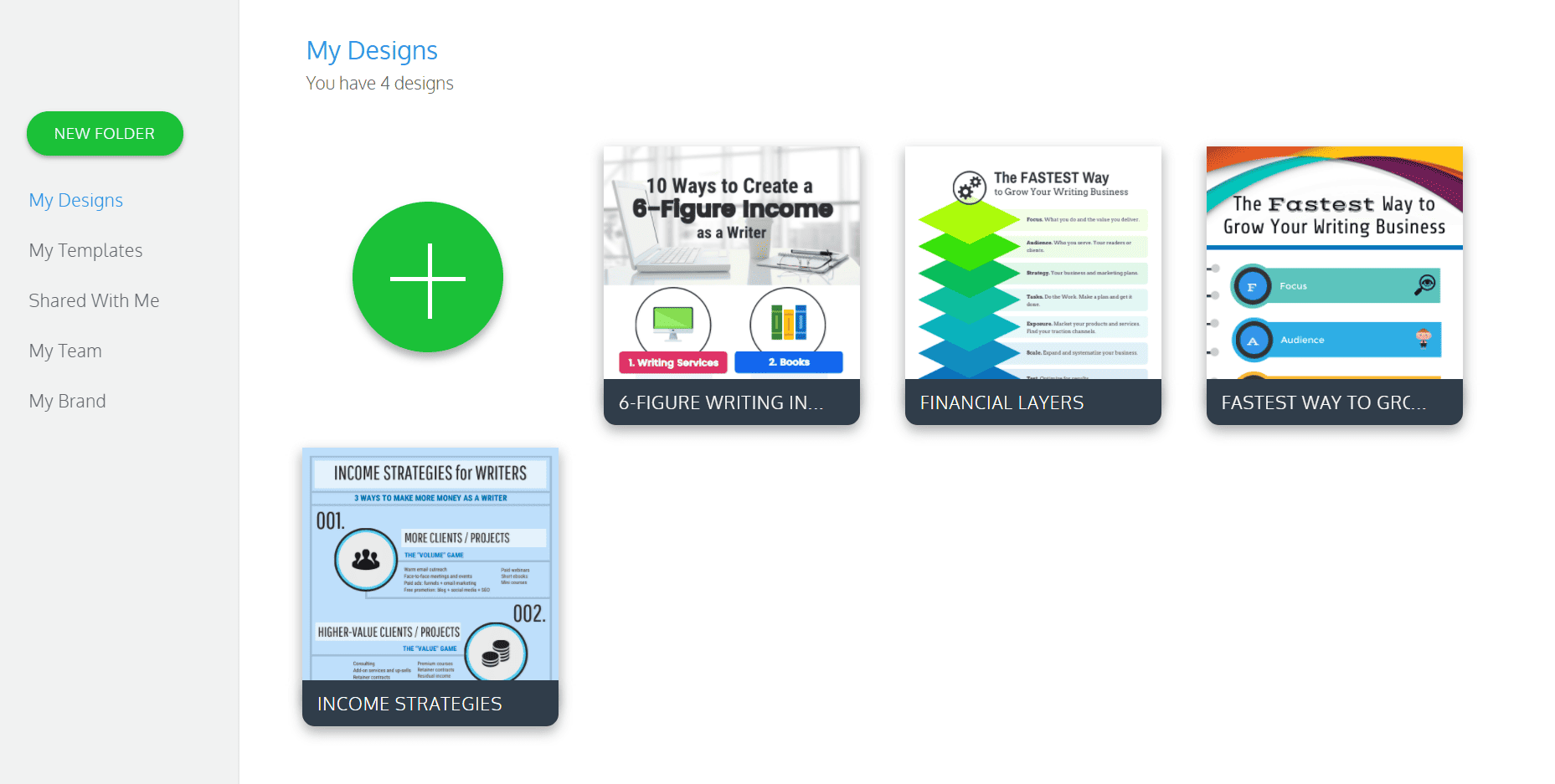
The 4 infographics I’ve created so far. I’m really pleased with the quality!
You can also create your branding kit so all your infographics have the same look and feel. Talk about time savings!
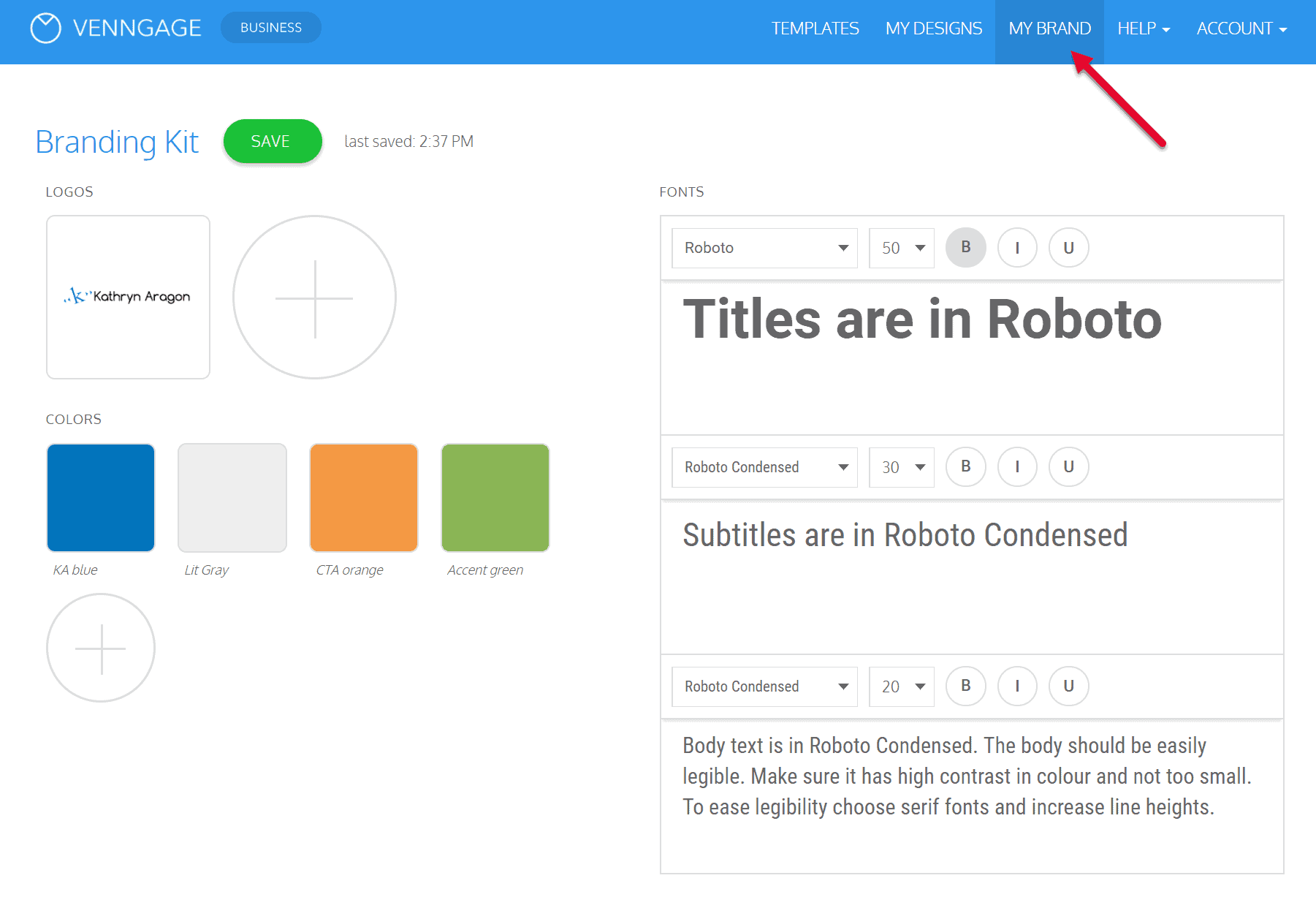
Create a branding kit to save design time.
Here’s a video from Venngage that gives you an inside look:
Why Should You Consider Venngage?
Today, there’s no excuse for not having engaging, well-designed communications. That goes for external and internal communications.
If you’re creating a proposal, report, or lead magnet, make it as attractive as it is useful. Add graphics, charts, and infographics to make dry data more palatable. Create beautiful editorial cards to present your information.
If you’re trying to make your blog more engaging, you’ll do well to add visuals. Infographics can be used to illustration sections of your article or to tell your whole story.
Best of all, Venngage is incredibly affordable at just $19/month for the Premium plan and $49/month for the Business plan.
They say a picture is worth 1,000 words.
It’s true. And with Venngage, you can create that picture in half the time it would take you to write 1,000 words.
If you create content, or if you struggle to share your ideas in an engaging way, you need to consider Venngage. It’s definitely worth the investment.
NOTE: I haven’t received any compensation for this review. It’s my honest opinion after creating 4 infographics with the tool.

