We all know the stats. For quality content, nothing beats visuals.
- Content with relevant images gets 94% more views than content without relevant images.
- Eye-tracking studies show internet readers pay close attention to information-carrying images.
- Infographics are liked and shared on social media 3 times more than any other type of content.
Here’s what that means: You shouldn’t settle for text-only content, no matter how good your writing is. For maximum engagement, you need to translate your words and ideas into visual experiences.
But the question remains: How? The cost of creating custom graphics and interactive visuals can be huge, from both a time perspective and designer fees.
Fortunately, I’ve found a solution that works for me. I’m pretty sure you’ll like it too.
It’s called Visme, and it’s an online software that makes it easy to create slide shows and infographics that are not only attractive but interactive too.
Why I Like Visme
I’ve played with other resources like this, but none has impressed me as much as Visme.
In my first few hours using it, I created an infographic and a slide-deck presentation. Both look great and the possibilities are endless.
I immediately embedded the presentation in a post on Mirasee, and for added value, I downloaded the presentation as a PDF so we could add a content upgrade to the post. Together, it transforms a simple post into something special.
Want to know how to get better results from your visual content? Download the Presentation Checklist here.
The infographic was my second trial with Visme. And yes, I could go the traditional route and create an infographic post. But what I actually wanted was another content upgrade. So I downloaded it as a PDF and ended up with a one-page download that looks fantastic.
Ready for an inside look?
Visme is an online software that allows non-designers to create content downloads, presentations and infographics that look like a designer made them. Watch this video for a quick introduction. Then I’ll share my experience with it.
How It Works
I have to be honest. When I first opened Visme, I didn’t know where to start. You see a sidebar, two buttons, and nothing else. So what are you supposed to do?
Easy. Click the blue “Create New Visme” button.
The good news is it’s pretty intuitive once you begin. And if you have any questions, you’ll probably find the answer on Visme’s support site.
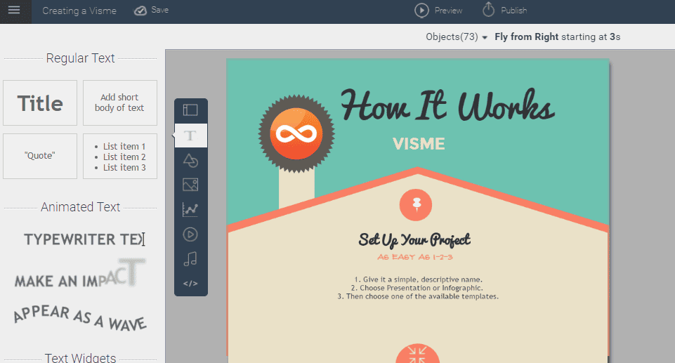
Just name your project.
Then select “infographic” or “presentation.”
You have a huge selection of attractive templates to choose from, and once it’s loaded, all you have to do is adjust the text and graphics to create the look and feel you want.
One of the things I like about Visme is that it allows me to create animations and interactive elements, which are proven to increase engagement. Simply select the element you want to animate and choose your settings. Really, it’s that easy.
Another thing I appreciate it how easy it is to make corrections. Even after you’ve saved and published your work, if you need to tweak anything, your embedded presentation is automatically updated.
Which brings me to my only challenge with using Visme as an infographic builder. Creating the infographic was fast and easy. When I downloaded it as a PDF, it made a beautiful content upgrade. But after embedding it in the post, it looked like the presentation, with the edges cut off and a slide deck control.
Fortunately, there’s an easy fix: When you click “Publish,” go to “Publish Settings.” Under “Design,” turn on “Responsive” and save.
Easy peasy. Your infographic now looks like an infographic rather than a presentation.
My Recommendation
Not only is Visme invaluable for creating high-quality visual content, it’s fun. Best of all, it’s affordable for any budget.
So what are you waiting for? You know you want to step up your content creation. Set up your free Visme account here.


