Several years ago, I did a Visme review as a first-time user. I was immediately impressed at how easy it was to create high-quality infographics and presentations without needing a degree in graphic arts.
Fast forward a few years…
After a fresh update, it’s time for another Visme review. Let’s take a look at the app, what it does, and whether it should be your visual content tool of choice.
What Is Visme?
Visme is an all-in-one content creation tool that lets you create and share beautiful content — including engaging presentations, infographics, documents, videos, and graphics — with little to no design skills.
Made for non-designers but still powerful enough for graphic designers, Visme combines simplicity, flexibility, and interactive features, so you have everything you need to create a engaging content your audience will love.
It’s like Canva, PowerPoint, and Presi, all rolled into one. Create interesting infographics and interactive presentations, as well as beautiful documents.
This new version was a complete overhaul. According to founder Payman Taei, “We worked over 18 months on our latest release and I’m confident you will find it refreshing and a game changer for creating beautiful content.”
My First Impression
Payman is right about one thing. I’ve always felt that Visme gives you beautiful results. I’ve used it to make infographics, presentations, and animated content. No matter what the project, I end up with something that I’m proud to put my name on.
That being the case, I was excited to be able to review this update.
My first impression?
Honestly, I didn’t see a huge difference, which says a lot about the original version — it was already a good tool before it got “fixed.” But then I went back into the original version and I realized my mistake.
This new version gives you an intuitive, clean user experience that you’re going to love.
It was a winner before the update. It’s still the visual content tool of choice, equipping you to create unique designs that look as if you hired a designer to create.
A Few Things You That Stand Out
Projects can be published and shared via a URL — anyone that receives the URL can view the project (they do not need a Visme account in order to view). It’s like turning your Visme project into a website. The key benefit to this is that projects will be viewable by the recipient either through desktop or mobile, and you can gain analytics on how the project is being viewed/completed. (I see this being especially valuable for sales.)
Data Visualization — Visme is big on graphs/charts. For communicating studies, stats, and the latest news, these visuals will really capture audiences and inform effectively.
Interactivity — This keeps audiences engaged and allows them to interact with content through pop-ups, hover-overs, and other interactive capabilities
Animations — Bring intrigue and flow to projects with the new animated graphics
What You Can Do with Visme
Templates
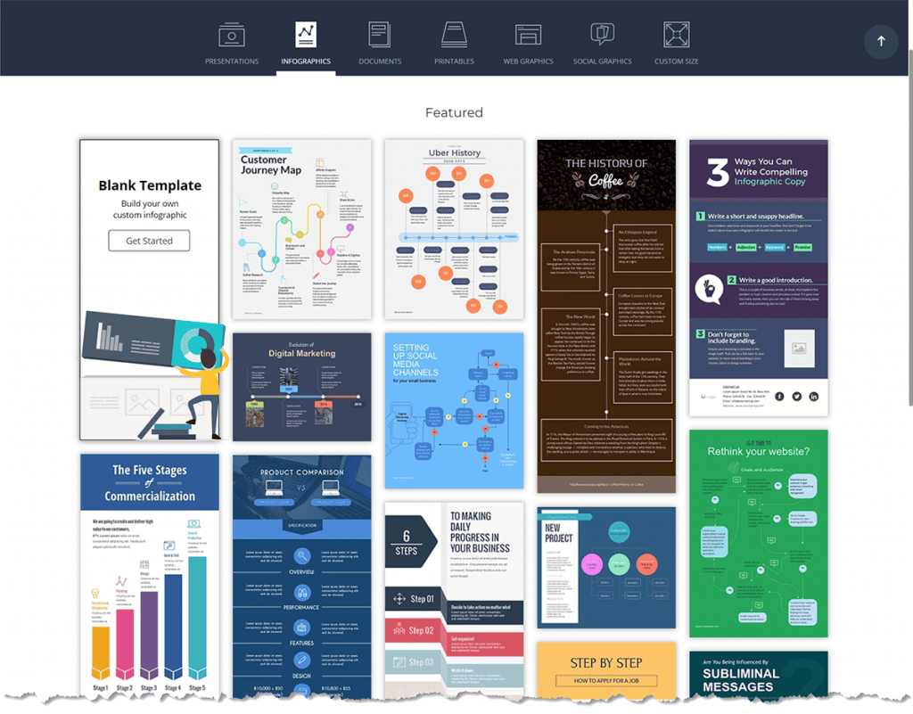
As with most visual content tools, you’re given a wide selection of templates for whatever type of project you’re working on.

For instance, with an infographic, you’ll find templates for sharing process, comparison, timeline, reports and charts, information, hierarchy, and how tos. You can also select templates based on the topic: anatomy, business, sales and marketing, non-profit, health and medical, education, location, resume, or science and technology.
With other tools, I often start from a blank template because I can’t find what I need among the premade templates. With Visme, that’s not a problem. If you can imagine it, there’s probably a template for it.
Seriously, Visme gives you more templates than any tool I’ve seen, and none of them are a throwback to 2005. They’re clean, creative, modern designs.

Design options
Once you’ve selected your template, you can change the text, graphics, colors, and layout. You’ll find pre-designed elements for your headers and text, stats and figures, graphics, and diagrams.

These give you a lot of design options, which is helpful. But remember, you can create your own look and feel by searching for graphics, photos, data, and media — or by uploading your own.
Visme has a library of graphics and photos you can use in your projects, which isn’t impressive — yet. My searches for relevant keywords turned up only a handful of options, if that. I’m certain that’s because this is a new release. Once the library has been moved over, this issue will resolve itself.
In the meantime, expect to play with search queries to find graphics you can use. Or, create your own and upload them.
One thing I am impressed with are the animated graphics, which come in three categories:
- Illustrations
- Characters
- Gestures
Characters can be people, dressed casually or professionally; mascots; or bots. Drag a character into your project, and it moves and waves. The bots are really cute.
As with the still graphics, there aren’t a lot of animations in the library yet, but again, I expect their numbers will grow over time.
Another feature I like is the ability to add videos and audio, or embed online content.
You could use these features to create a presentation that plays a video with music in the background — giving you a lot of options for digital content that’s truly impressive.
Precision and control
As you’d expect, you can move elements forward and backward, and control their opacity. You can also animate elements, so they move into view exactly when you want them.
When working on a layout, one thing I appreciate is the precision I can achieve with Visme. That’s something you don’t get with most other tools.
You can set the precise location and angle of your graphics, so when you’re trying to align different elements, you’re confident you’re nailing it.

With this upgrade, you also have more control over your colors. Instead of clicking and hunting for the right color, you can type in the hex code or adjust the lightness or darkness to find the exact color you’re looking for.
Branding
Visme lets you set your branding, so you can quickly create something that’s on-brand. To test this feature, I uploaded the brand colors and logo for one of my blogs, Vivacitie.
Selecting the colors in advance saved me a lot of time. Whenever I wanted to tweak an element’s color, my brand’s colors were already loaded on the palette. I could either choose one of the template colors, a brand color, or even create a new color.
There was no way to choose my preferred fonts, though it will allow you to upload fonts. I chose not to do that because I knew my fonts were likely already in Visme’s library. Unfortunately, every time I opened a text box, I had to scroll through the list to find the font I wanted.
If they fix this, it will speed things up for you. Until then, plan to copy and paste your text boxes — or use the “copy style” button at the top of the page. (It looks like a sparkling paintbrush.)
Another issue I had was with the logo. As I mentioned, I had uploaded my logo when I set up my branding. I expected to be able to click a button and import it into any project, but sadly, I was never able to find that button. I ended up uploading it into the project.
Sharing
With Visme you can create your content right in your browser and use it online or offline. You can publish online, make it private, embed to a site, or download for offline use.
Formats include JPG and PNG for images; PDF for documents; MP4 and GIF for animations or videos; and PowerPoint, Keynote, or HTML5 for presentations…
Which means you can create whatever type of document you need, and give it a beautiful layout, graphics, and even audio.
Price
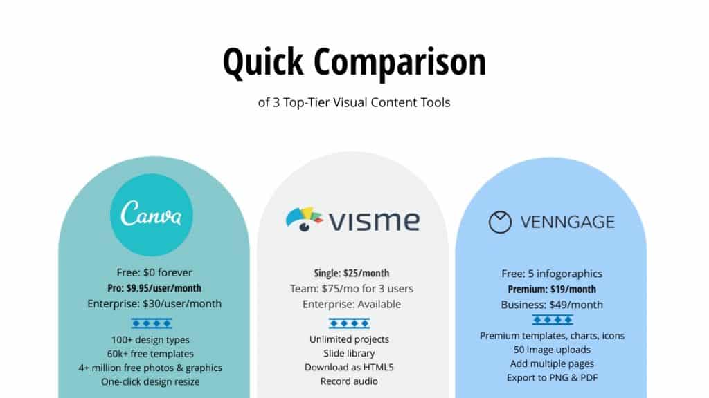
Visme is a premium tool, and its pricing reflects that. You’ll pay more for it than you will for Canva or Venngage. But as an all-in-one content creation tool, the price is fair.
In addition to creating infographics and presentations, you can create print-ready documents and videos. And no other tool in this category allows you to add audio.

If you want a tool to create infographics and nothing more, then Visme probably isn’t for you. If, however, you want to create high-quality documents that you can use for every aspect of your business, then Visme is a good option.
Visme Review: Final Thoughts
The new and improved Visme is an exciting tool for a content geek like me. I love the sheer number of options it gives me. And as I think about the incredibly advanced, modern designs I can create with it, my imagination lights up.
Visme was at the top of my list when I reviewed it the first time. After this upgrade, it’s still one of the best visual content tools on the market. The few issues I had are minor when you think about the quality of the end design and how easy it is to make them.
If you want to create impressive, beautiful documents for your business, I highly recommend Visme.
NOTE: The graphics in this document were made with Visme.


