When you’re new to digital marketing, you generally start by learning the “rules.” But it doesn’t take long to realize that for every rule, there’s an equal and opposite one claiming the same results:
- “Headlines work best when they’re 8 words or less” v. “Long, benefits-laden headlines work better”
- “Yellow buttons with blue text work best” v. “[insert color] buttons work best”
- “Call to action must be above the fold” v. “End with a strong call to action”
- “Security icons reduce stress” v. “Security icons can raise anxiety”
- “Always include a smiling person” v. “Always show your product in action”
- “Have your smiling person make eye contact with the user” v. “Have your smiling person look at your product”
- “Long-form landing pages always perform better” v. “Short-form landing pages are more likely to get read”
- “Lead with benefits” v. “Lead with features”
It makes you want to throw up your hands and demand, Will someone PLEASE put together a definitive guide for what works best, so we can get the results we’re looking for?
Trouble is, it doesn’t exist.
Conversion optimization isn’t a paint-by-numbers proposition. There’s no one right way to do anything. No checklist. No “proven” method that always wins clicks.
“Best practice” is the term we use to describe “what usually works best.” It’s the guidebook we’re looking for. But best practice isn’t conversion optimization. What works for one brand might not work for yours—which is why you have to test.
If you’re new to testing, that’s hard news, I know. But I do have some good news for you: There is a guidebook.
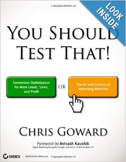
 It’s called You Should Test That! by Chris Goward and, as the name implies, it’s a great introduction to testing as a way to improve conversions.
Of course, it isn’t only for beginners. If you’re interested in taking your marketing to the next level, whether you already have a culture of testing or are a newbie, you’ll enjoy this book. It’s easy to read and understand, and after reading, you’ll walk away with at least a handful of ideas for improving your game.
Here’s some of what you’ll learn…
What is and isn’t conversion optimization?
Goward starts with the basics: what is and what isn’t conversion optimization.
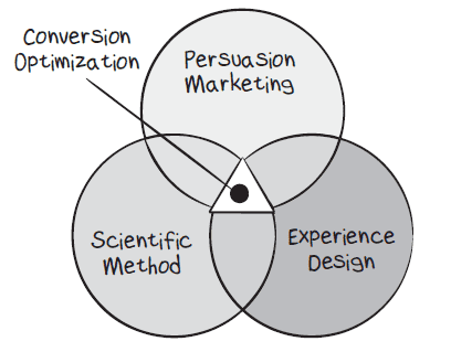
It isn’t a lot of “rules” that have work for other brands. Instead, it’s the point at which persuasion marketing, user experience and scientific method overlap. In other words, art and technology and science, working together.
Persuasion marketing – This is the artistic part of your presentation, the sales pitch, crafted to build interest and desire and make people want to buy. As Goward says, “It involves communicating the right message to the right people at the right time with clarity.”
Experience design – This is the technological part of your presentation. You want a design that’s intuitive and makes it easy to buy. Every element needs to work seamlessly, so you never lose a sale from poor usability.
Scientific method – Each of the first two elements (persuasion and design) are based on assumptions you make about your buyers. When you craft your pages, you’re essentially guessing about what will make people respond. Once those pages are live, it’s time to test to figure out what works, what doesn’t, and why.
According to Goward, “this requires using a rigorous process of continuous testing, iteration, and improvement.” That’s the what. The rest of the book tells you how.
How to improve conversions
All tests begin with analysis of your audience and what they respond to. If you’re optimizing an existing website, this would be an evaluation of how they’re responding to your existing pages.
Essentially, you’re looking for problems and issues that could be keeping you from getting better results.
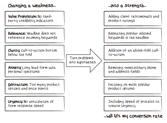
Once you know what your problems are, you make a hypothesis about how you could fix them. Something like this:
In the book, Goward shares the 7-step process his team uses as WiderFunnel.com and clearly explains how to complete each step. You’ll also find plenty of case studies that help you apply the concepts to your own website.
The thing that stood out to me is that it never starts with copy or design, which is where most businesses want to start a Web project. It starts with strategic analysis and a hypothesis.
The LIFT Model of conversion optimization
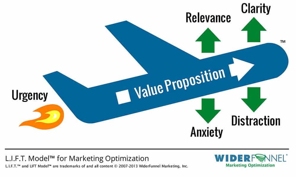
One of the things that makes You Should Test That! such a useful resource is Goward’s visualization of the testing process. It’s called the LIFT Model:
On an airplane, lift is created when faster air flows below an airplane’s wing and slower air moves over it. In the same way, LIFT on your website depends on six elements working together.
It starts with your value proposition, which Goward describes as “the full set of perceived benefits and costs, in the prospect’s mind, of taking your call to action.” When value exceeds cost, people are ready to take action.
But just having a good value proposition isn’t enough. It has to be relevant and clearly stated, with no distractions or anxiety-producing elements. So your job is to improve the positives while reducing the negatives.
Finally, when everything else is in place, you can test the turbo-boosting element of urgency for added LIFT.
Put this on your reading list
I read a lot of conversion optimization articles and books. Some are so technical, they feel like a homework assignment. Others provide good information but no fresh perspective on the subject.
You Should Test That! stands out from the pack. It’s an enjoyable read—and it goes deep without getting too technical.
If you know testing is your next step but don’t know where to start, this book will show you how to approach it from beginning to end, so you feel comfortable moving forward.
If you’re already testing and simply want ideas for creating better hypotheses and higher lift, the case studies and examples in this book will inspire you to try new things.
My recommendation? Buy the book. Then study it. It deserves a place on every marketer’s bookshelf.


