How do you sell to time-crunched consumers?
Some experts tell us to cut our copy in half and then trim it some more. But let’s face it, there are only so many words you can cut before you run out of words.
People’s attention spans may be growing shorter, but they still need and want information before they buy. The key, then, isn’t word count, but presentation—and that’s what the “new” short-form landing page is all about.
Today, “short form” isn’t about length. Instead, the focus is on keeping readers engaged with visual, scannable information. You can use several hundred words or a thousand. The key is to use the right words and to share them in a way that can be understood at a glance.
Short-form isn’t about word count
To begin, let’s consider your audience. They don’t read; they scan. If they see a great wall of words, they usually click off the page. If they don’t see the information they need right away, they click off the page. And if they have any doubts about whether you can help them, they click off the page.
Click happy, aren’t they?
That’s the challenge of marketing on the social Web. Which is why you don’t need to worry so much about word count. There are far more important issues, such as a trust, credibility, and finding the message that resonates with your audience.
Getting the message right
Selling to time-crunched consumers means you can’t afford to write fluff. You must evaluate your message and distill it to its essence.
In particular, you need a strong value statement that tells people what’s in it for them. You also need to answer questions and overcome objections.
After that, it’s not the number of words that matter, but getting the message right and sharing it in the right way. Let’s review.
If you want to shorten your landing page, you have to get to the point quickly. You need to answer three key questions as quickly as possible:
- Who are you?
- What do you do?
- How does this help your customers?
Most websites are doing this with short modules that are scannable and informative. These modules may have an image, or they may be text. In most cases, each module addressed one key element of a landing page:
- Trust
- Benefits and/or features
- Your process and/or approach
- Why people choose you
- Information that overcomes objections
Conversion Sciences is a great example of a modular landing page that shares a lot of information without overwhelming you with text. Here’s a screenshot of the page, with the purpose of each module marked to the side.
Each module addresses a different part of the sales presentation. The modules are separated from one another by different background colors, text boxes, or graphic elements.
While it is a text-based presentation, it doesn’t feel overwhelming. That’s because each module addresses one piece of the sales presentation. Readers can scroll until they come to the sections that are most important to them.
Here’s another example, Apple’s sales page for the new iPhone. Here, white space and beautiful product images create the modules. Notice that each module addresses a major feature of the iPhone 6. (This is a portion of the page.)
Apple goes heavy on the images, providing only as many words as necessary to explain each feature or benefit.
As you can see, by combining images and short blurbs, you can create a powerful sales page without a lot of words. The key is to choose your words carefully.
Presentation is everything
When we talk about long-form versus short-form sales pages, we’re usually talking about word count. But as you can see from the two landing pages we just reviewed, you can have a long-form presentation with only a few hundred words.
Because it’s visual and scannable, it’s not overwhelming, despite its length.
Interestingly, most landing pages are moving in this direction. It’s not often that you see a fully text-based sales page any more. By including images and other visual elements and by putting lots of white space between sections, a landing page seems less intimidating. Readers don’t feel like they have to read every word. They can scroll through the page until they find the sections that are meaningful to them.
Start with your value statement
In most cases, when people arrive at a Web page, they want to know what the page is about and if it’s appropriate for them. To answer these questions, many websites are putting the brand’s value statement or a primary benefit at the top of the page.
This is where it gets interesting. Often, the words only give part of the message. The image adds to the message with visual cues that work with the text.
Let’s look at a few examples.
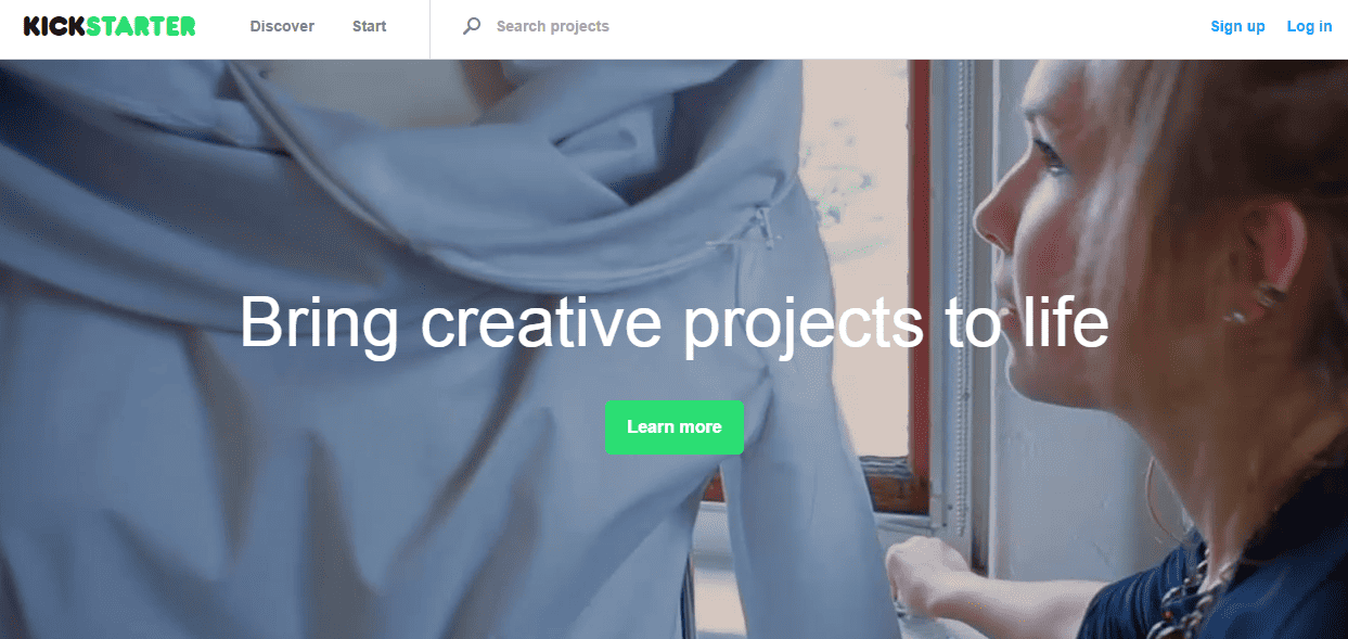
Kickstarter has a looping video behind its value statement, “Bring creative projects to life.” The words are simple. The video gives context. If you are a musician, artist, dramatist, seamstress, or want to pursue any other creative venture, you know immediately that this site is for you.
With the images so clearly communicating the “how,” only a few words are needed to explain the “what.”
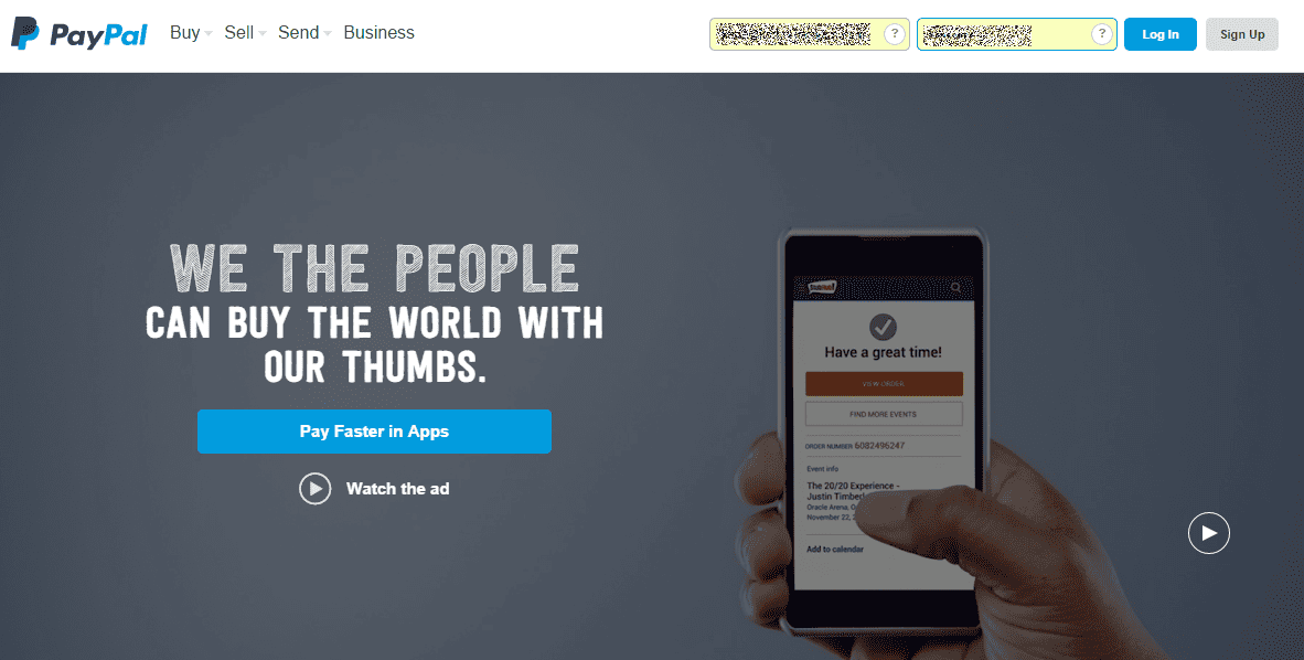
PayPal also tends to use a moving background. The image above was actually the final image in a series. But the message was clear: all types of people use PayPal, and all enjoy easier online purchasing because of it.
Here, the words are more of a benefit than a value statement. But they work together with the images to tell you what the page and/or product is about.
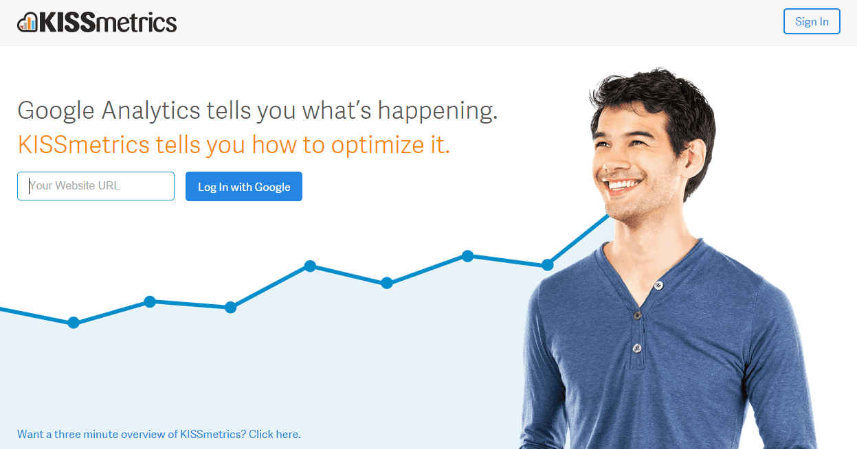
KISSmetrics has a clear value statement that pits its services against Google Analytics. The bar graph suggests you’ll get better conversions by using KISSmetrics, and the smiling face (notice he’s looking at the brand name) suggests this product will give you the profits you seek.
On many landing pages, you can scroll down to find more information—a necessary approach if your product or brand isn’t well known. But KISSmetrics is a recognizable brand so they only provide a link in the lower left hand corner for people who want more information.
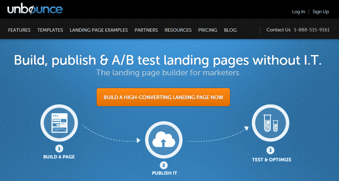
Be aware, your cover image doesn’t have to be a photo or video. Unbounce does a terrific job of communicating its core message using icons, which effectively tell users that they make landing page creation as easy as 1-2-3. In this case, the value proposition plus the graphics make a compelling statement.
Present the rest of your pitch in separate modules
Once you’ve told visitors what you do and how it will benefit them, tell them how you’ll do it. There are no rules and no specific format.
In most cases, you need to share features and benefits, trust builders such as testimonials and brands you’ve worked with, and explainer text. If you have a service, explain how it works and how it benefits people. If you sell a product, review features and benefits, how people are using it, and how it helps people.
As in any sales presentation, present your modules in a logical way. Ultimately you want to keep readers engaged and answer questions as they arise.
Short copy isn’t slapped-together copy
Bottom line, if you want to create landing pages for non-readers, focus on conversion, not length. A “short-form” page may look long, but it will be easy to review and easy to absorb.
Also keep in mind that “short” isn’t the same as “thrown together.” They are just as strategic as long-form pages.
Here’s what matters most.
- Express your top benefit as a value statement at the top of your page.
- Craft an “elevator speech” for every selling point you need to make.
- Wherever possible, use images to help get your message across.
- Keep the focus on your prospect, answering “what’s in it for me.”
- Answer all questions and address all objections.
- Include trust elements.
- Craft strong call to action and display it prominently.
Think scannable and informative, so prospects can get as much information as possible without having to devote a lot of reading time. But never sacrifice your message. Whether you tell it in images or words, you still need to give people information that drives action.
