We live in a world of people with short attention spans.
From the time a visitor lands on your website, you have just 7 seconds to capture their attention.
That doesn’t leave you with a lot of options, so you’re going to need to make a good first impression. And your web design is key.
A Need for Speed
Because you have a limited time to captivate your visitor, you need to make sure your web pages load in a timely fashion. Your entire site should fully load in 5 seconds or less.
Needless to say, optimization is necessary for both mobile and desktop versions of your site.
The faster the better…
Which means you must try to minimize the file size of your site as much as possible. More users are now running on mobile devices, usually connected to speeds much lower than what we are used to in our homes or offices.
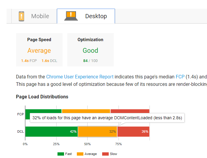
Want to know how your website stacks up in a speed test? Use Google PageSpeed tools.
It’s a great free tool that brings back a rating and provides you with recommendations on things that you can do to improve your page speed.

The 7-Second Test
Time isn’t the only thing you need to be worried about. You need to gain users’ trust and interest in the first 7 seconds they spend on your page.
That’s why the 7-second test was developed.

Basically, the goal is to have someone to look at your site for exactly 7 seconds, then have them report back their findings.
They should be able to answer the following questions.
- What is the site about?
- Is the website appealing?
- What action should you take next?
- Would you be likely to share this site?
If they are able to answer these questions correctly, you’ve done a great job on your website design. If the user is unable to understand what the site is about and the action they are supposed to take, you need a re-design.
A Clean Design and Clear Call To Action

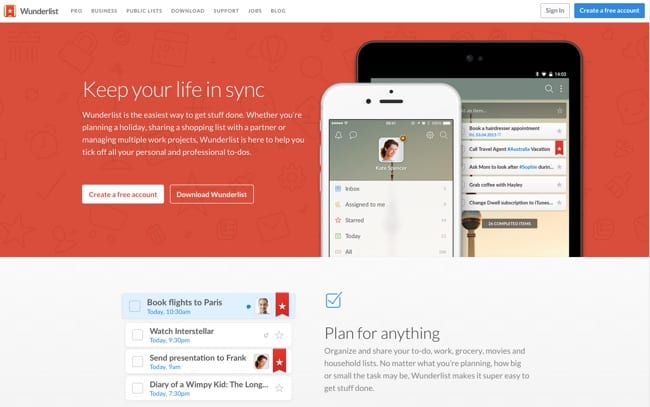
Above is an example of a clear landing page designed that passed the 7-second test.
The landing page is clear, clean and has large easy-to-read fonts with a strong call to action button.
Your home page or landing page should contain a combination of quality content blurbs, with supporting images.
Be careful, though, to avoid wrong placement and spacing. Notice on this site, there’s a large cushion around images and call to action buttons. That helps them stand out.
When designing your site, the area that’s visible above-the-fold is most important, Keep this area clutter free. You only want enough information on your primary page to capture visitors’ attention and focus it on a strong call to action.
Here are 8 of the most common call to actions on a website:
- Create an account
- Form submission
- Social sharing
- Download App
- Join our email list
- Contact Us
- Digital Downloads (whitepaper, guides, cheat sheet, etc.)
- Webinar registration
Top Ways to Master Conversions
After your site is well designed, your speed is optimized, and you’re getting visitors, it’s time to tweak your site for conversion performance.
For digital marketers, conversions keep the business running.
Unfortunately, we only have those 7 seconds to get users interested in clicking on your call to action. Not to worry, though. With these powerful tips you’ll see a big boost in your number of opt-ins.
- Less is more: During your registration path, fewer form fields mean more sign-ups. When you simplify your opt-in flow or your checkout procedure, you’ll get more results — because it doesn’t look overwhelming to the user. If they feel like they can fill in all the details in less than a minute, they’re more willing to complete the form.
- Use urgency: Make the user feel like they don’t have much time to make a decision, like they’ll miss out if they don’t act now. Use verbiage such as “Only 4 spots left to register,” “6 hours until the sale is gone,” or “Act now.” You can even place a countdown timer on your site to help visitors see the urgency.
- On page testimonials: Testimonials are a proven way to eliminate doubt in your buyer’s mind. If you make a buyer feel like you’re a trusted source, they’ll be more inclined to provide you with their email address and engage in other business with you.
Check out this list of 39 ways to boost conversions
Filtering in Your Funnel

After making the necessary changes to your site and seeing a boost in performance, it’s also important to filter your funnel.
You see, not all inbound leads are good quality.
Especially if one of your calls to action is to get a free trial or to download a free ebook. These tactics usually capture the attention of bots and people fishing for freebies.
You need to start vetting your leads at the point of entry:
- Checking for typos
- Looking for multiple submissions from the same IP
- Identifying spammy email opt-ins
Collecting these types of email addresses will only damage your inbox deliverability, so you definitely want to weed them out.
And to simplify that process, making it easier to figure out which leads are good and which are bad, you need to rely on proven software options.
Xverify is an intelligent email verification solution that works with your existing registration form. If a user makes a typo or types in an email address that is not a real account, they are going to instantly see an error message.
This significantly weeds out poor quality data so you and your team don’t need to waste effort on fake leads.
Do you have tips on gaining more conversions with your audience? The community would love to hear what has and has not worked for you. Leave some comments or suggestions below.
About the Author: Krista Barrack is Sr. Account Manager with XVerify.


