Just like your upset stomach spews useless poisons from your system, so will readers reject your content if it turns out to be used garbage.
Instead, do readers a favor and increase your engagement at the very same time by taking my advice and stop vomiting content.
What do I mean? All you’re trying to do is present a consistent on-topic blog post, am I right?
Well, forget consistency and introduce yourself to meaningful.
Relevant content that smacks an audience in the face, resonates with them via their heart and then their head, and offers something new and fresh—or at least adds an extra twist of some sort—beats weekly vomit, hands down.
Look, I’m not saying you can be a slacker and offer your audience no consistency at all because that won’t work.
But I am saying consistent quality is more important than consistent timing. This assumes, of course, you don’t have the resources (time, writing team, budget, etc.) to guarantee a set editorial schedule.
Because if you do, you should. But make sure, in every case, you top the icing of a consistent, set content schedule with high quality (which, if you think about it, is the cherry on top).
Here’s the thing, people: Too many of you sound the same out there. Too many of you write about the same thing and just spit it out in the same old way as everyone else.
I know ‘cause I’ve read it. Over and over.
Listen up. It’s crowded out there; you need to stand out. Like a pink flamingo among a flock of mallards, or a black swan in a sea of white.
Find your creativity or maybe meet up with it for the very first time, but just make sure you do because practicing ideas will give you that little neon shine that you need to get noticed.
Go ahead—practice turning your sparkle up a little 🙂
Be creative.
Be original.
Illustrate your ideas or information.
Zig instead of zag.
Look, I’m not trying to be critical. Honestly, I want to help. And seriously, I was feeling pressure to conform to the typical and same canned standard that so many online sites, marketers, writers, and bloggers seem to tout.
But I think in trying to do it “right” and by following the crowd and trying to do it the standard and expected way, I lost something important. Me.
And the surprise is, when I couldn’t stop myself and threw Sue-Ann into the mix, weird perspectives and ideas, too, things started to change and go better, in fact.
Kristi Hines was a huge help to me in discovering this because she understood this before I did.
Here’s What Happened
I pitched Kristi an idea, and she approved it for inclusion on her site for freelance writers and bloggers, called Kikolani. I was thrilled as Kristi is one of the best in the writing biz and I’ve been a fan of her work for some time.
But, after I hit the submit button, I had scary second thoughts. So much so that I sent a follow-up email to Kristi explaining to her that more than likely she may want NOT to publish the work.
I offered to take it back. I know that sounds crazy, right?
But I realized that my latest offering (my 3rd approved post on her fantastic site) had NO LINKS in the entire thing. None. Zip. Zilch. What was I thinking? What was Kristi thinking?
My successful posts on her site before this one had tons of useful links to top-notch resources. All successful blog posts had at least a few significant linked resources. All. Had I lost my mind?
See what I mean—panic and my offer to take the work back resulted.
The return email from Kristi advised me of the publish date. Oh my goodness. She wanted to publish it. Oh nooooooo.
Oh my gosh, oh my gosh. Oh my gosh. A major failure was imminent!
But no. I got comments from people who felt a connection with my completely link-less but honest story.
I was so moved. I am still elated at some of the inspirational, poignant, and interesting viewpoints. And I can’t wait to give Kikolani readers the second part of the tale. What a surprise. And what a lesson learned.
Being myself, an original, with a completely authentic and original story was successful. In fact, this piece of work has a page authority rank of 45, and although primarily a statement to the authority and success of Kristi’s site, it felt like a small win.
And it also gave me more confidence just to be who I am. What a relief.
The lesson? Everyone has a story. YOU have a story. Don’t be afraid to tell it. Even if you do it in a way that’s not so “typical” like my story excluded links, a rule breaker by many Web publishing standards.
Thank goodness Kristi saw value beyond the link, and wasn’t as short-sighted as me. Or maybe she was just willing to gamble, take a little risk or experiment as I did by asking if a “part two” would be of interest to readers.
Hey, maybe I was a little creative and original in this one. Hmmm.
Now Let’s Talk Perspective
It’s kind of like an opinion or a nose—everyone has one. The trick, of course, is to offer a unique perspective which comes from your own experiences and ideas.
Magazine journalists call it the hook or spin; taking a concept— even a known one—and bringing that topic to light in a new or original way. An editor wants to know: “What do you have to contribute that’s new to the discussion” and “Why should I publish it now?”
So when creating content, think about those questions. You need to offer something that is both timely and new to get noticed.
And new, in my view, often generates from having a perspective.
The good news, of course, is only YOU can offer your perspective. I use this for writing ideas all the time. Sometimes a gap in the information I’ve read sparks an idea or looking at the opposite viewpoint of what is highly repeated initiates some interesting food for thought.
Comparing opposites or offering a contrarian viewpoint can spark interest and discussion. Interaction is what you want, so yay! Just be careful to offer solid reasoning, data or even examples to back your thinking and strengthen your position.
Another way to use perspective in Web writing that’s very effective is to share the story of your experience.
By being transparent in exposing, for example, a problem (like how to use SEO for page rank or how to write headlines that get clicked) then demonstrating how you did what you did (in actionable steps and procedures for readers to follow) and ending with your stellar results (that they too can achieve), you’ll build both trust and engagement.
Andy Crestodina seems to apply this “Here’s Exactly How I Did it (And You Can too) Technique” a lot on his Orbit Media site.
Okay, I’ll go ahead and admit it aloud here and now. I’ve grabbed that code snippet he offered to use for my needs or applied a Google Analytics filter to exclude my site visits from traffic—just like Andy simply explains—even if some of his highly analytical outlook is still a little over my head.
That’s the thing—Andy Crestodina always makes his story include why I need to pay attention to action steps for me, and I get a result (little or big) I can use.
And guess what, I visit Andy’s site to look around for more good stuff I can use all the time, or follow Twitter leads to articles if they’re his.
I have an idea as I get familiar with his work, Andy has an analytical perspective that he most always brings to the table. And, I will learn something or other every single time I read the guy.
Analytics and I are only slowly developing our friendship, so I know I better pay attention when Andy gives tips.
If you get emails from opt-ins to sites, you subscribed to for whatever reason, which emails do you open first? Or maybe it’s more like, do you open at all?
The answer for me—hands down—are the ones that bring a powerful perspective. The ones that present any topic at all but, with a fresh outlook. The ones I think will add something new to my information overflowing brain. It’s that simple.
Ana Hoffman has a perspective, and you can’t very well miss it when you visit her TrafficGenerationCafe website, just look:

Notice how Ana takes her logo to her Twitter profile, showing it not only as an icon in her texted name but subtlety, she shows it both on the computer screen and as a coffee cream design in her background image. I like how she introduces blogging into the mix for traffic, getting business out of the way, before adding some personality in her fun, quirky, Ana way.
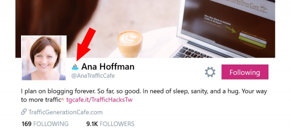 Oh my goodness, Ana Hoffman is not afraid to have a perspective AND throw in some creativity and personality on her merry original way. Talk about a triple threat.
But wait, besides the opportunity Ana gives readers/clients to learn about, gain and hack that big fat traffic we all need and want, one of my favorite features she brings subscribers is the Weekly Marketing Skinny. While it may not always be weekly, it is always packed with the good stuff on marketing, technology, social media and other topics with up-to-date info, tools, and advice.
There’s not one issue of the Skinny that hasn’t taught me something new. Not only new but things I somehow missed amid my own myriad of reading on the same topics.
And while Ana is curating the bulk of this work, proving her serious business acumen amid her funnier personal style, she adds opinions and offers things to think about along the way.
Pretty sweet move, Ana, spicing up curation with a personal spin.
Despite Ana’s 10,000 Twitter followers and who knows how many subscribers to her many offerings, site and newsletter, I swear Ana is talking to me, and we are struggling our way through the same business decisions and dilemmas together.
Hmmm. It looks to me like Ms. Ana TrafficCafe oozes that special mix of unique I’m talking about! And no, I didn’t think of her before I came up with my criteria and outline for this post, but boy does she fit perfectly into my thinking.
To Illustrate My Next Point
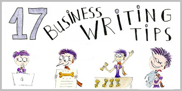
Let me introduce you to Henrietta, oops, I mean Henneke Duistermaat, and one of her latest blog pieces of work, (starring Henrietta, her signature hand-drawn creation and writing mascot) published just in time for me to show to you and, alas, prove my case!
“She’s called Henrietta, and she’s my alter ego. A little younger, a little more outgoing and braver than me.” Henneke Duistermaat
Henneke and Henrietta (and friends) tell readers, subscribers, and clients memorable stories by accompanying Henneke’s written work and, I think, are the blog’s signature, in a way—certainly a recognizable feature to Henneke’s Enchanting Marketing brand. Below, you see how Henrietta steals the show and handles, quite effectively, Henneke’s whole message, succinctly, understandably, and in a useful format. Perfect.

Henneke and I agree she created an infoDrawing:
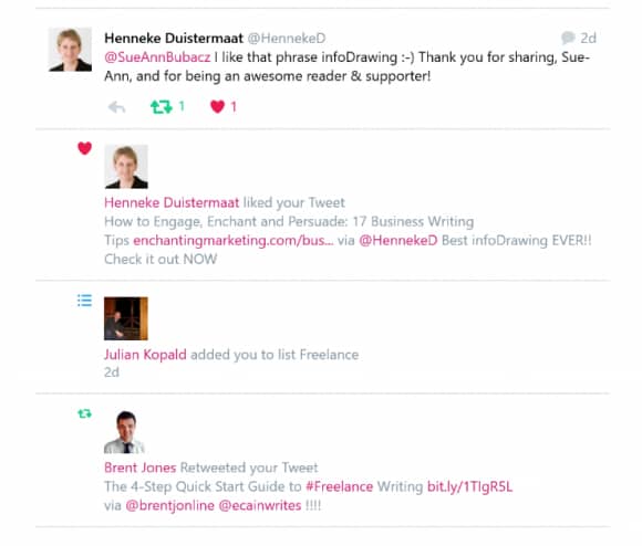 Beyond the clarity of her message, the fun way Henneke presents it makes it more engaging and cements her style as simply enchanting. And by that, I mean, one of a kind. Besides being the best infoDrawing EVER, doesn’t Henneke’s original work inspire you?
And speaking of engaging, Henneke is a pro by every measure. As you see in the tweet above, she responds to her readers and supporters every single time. I feel like she knows me and, more exciting to a guy like me, I feel she appreciates me too, so WoW!
Of course, the real lesson Henneke reveals by interacting on her blog, in Twitter, etc., is that of connecting with real people like you and me. Real people who make up real businesses.
Real people who are readers, customers and fans.
And I find the real pros, like Henneke, make time and put in considerable effort to make that connection. It matters.
In fact, the way I see it is, if you don’t want to interact with people, then don’t ask for comments on your blog and don’t do social media. But if you do, you need to be social.
How is your audience supposed to be engaged and your efforts be interactive, if you don’t interact?
Maybe it’s just me. But I feel if the likes of Kathryn, Henneke, Ana, and Mark Schaefer, just to name a few, aren’t too busy to engage with their audience of subscribers, followers, associates, students, clients and more, then what’s your excuse? I’m having trouble thinking of one you can use because if this small group mentioned, accomplishes what they do in a week and still can engage then, well, just do it; that’s all. Be a pro.
Oops. I digress and fell into a mini-rant, I guess, but I know for a fact, that any of the above, highly successful “influencers” will answer your question. Period.
And if you’ve ever asked a question in social or replied to comments on blogs you are interested in and not gotten a response at all, how do you feel?
Just throwing it out there as a little food for thought.
Yep, visual content enhances engagement, but interactive and truly engaging content goes even deeper.
Henneke gets more comments on every post than most sites I visit (including me) have in total.
Here’s a sample of a recent guest, commenting on Henneke’s infoDrawing above, and out and out stating my point of this section—proving the positive trajectory that comes from setting yourself apart from others:
Elvire Smith says:
As always, brilliant. Thanks Henneke! And your drawings are just so nice, they really set you apart from the rest of the bloggers. It’s wonderful to be different and stand out! You go girl!
Even if you’re strictly a word person, make data more memorable and highlight your facts for readers by making written information visual.
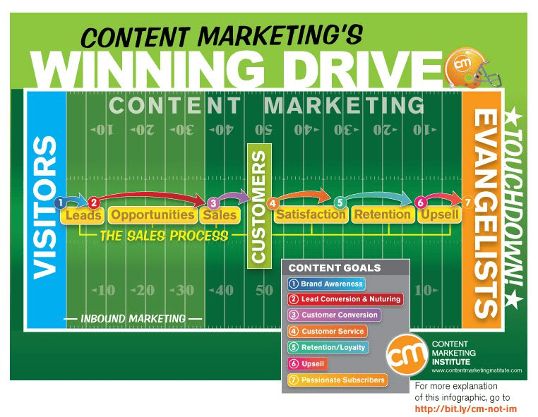
Do this by presenting data or backing your discussion with visual content and mixing up the types of graphic components you use. Instead of a typical graph or list, MarketingProfs “about page” is a nice example:

Or do something like this:

Every picture tells a story, and so the use of visuals in conjunction with your content has an important function, conveying something meaningful to viewers.
Make sure to use the following guidelines:
- Make sure graphics belong and are relevant to your point
- Always attribute sources properly and provide appropriate keys
- Enhance your data by using a memorable visualization of the information
- Evoke emotional reactions in how you present ideas visually
- Consider design factors like colors, font, style, etc., for viewer ease of use
- Mix art and science to provide a valuable graphic representation for your work
Incidental Comics is a “words and pictures” website destination by Grant Snider, who I recently discovered via a Google+ contact and I love so many of his “picture stories,” I think I want just about every one of them! Take a look:

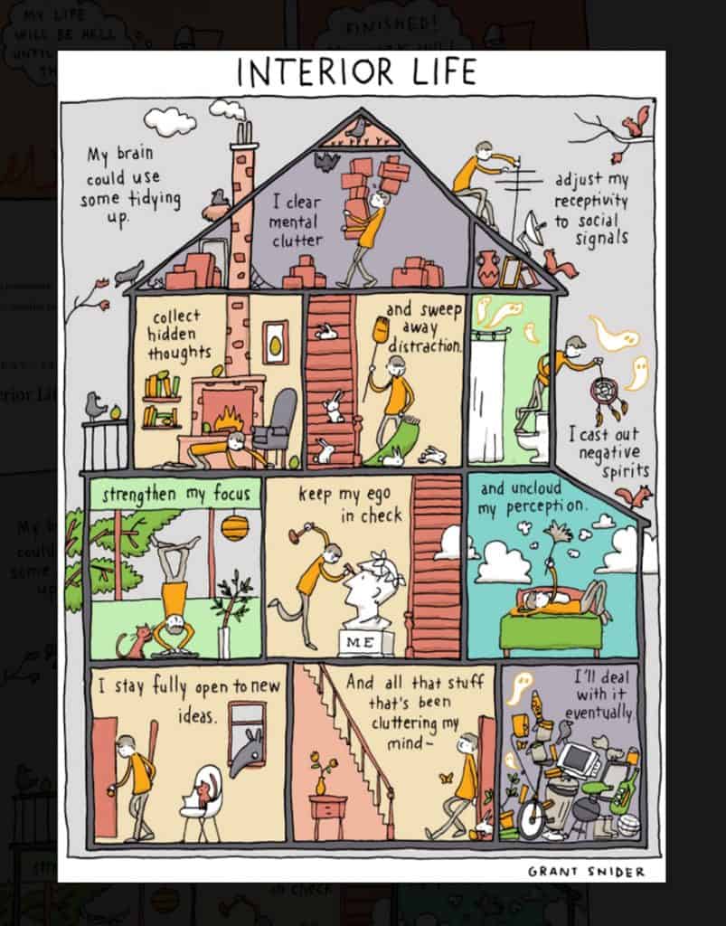
Now granted, Grant is an artist, but he combines words and visuals in such an appealing way, it’s worth a look at his work, even just to spark ideas or to realize the strength and impact of the word/graphic combination for your uses.
Rand Fishkin of Moz uses another old-fashioned visual technique, making his site’s video lesson series WhiteBoard Friday’s by using markers on a whiteboard to draw, illustrate or outline his points for subscribers, users, and visitors.
Professor Rand, tech guru Moz guy, goes completely off his high-tech rocker—and to much success! Bravo for illustrating your point visually in a different and unexpected low-tech contradictory fashion and manner 🙂
Well, you get the picture (pun intended).
From SlideShare to photos to sketches to charts/graphs to screenshots to infographics to artwork to chicken scratch (thinking of you Neville Medhora, Kopywriter!) to—you name it—illustrating your words visually adds impact and, sometimes, speaks even louder than your words to make your message understood.
Why not make your message stronger? More memorable? More fun?
Go Ahead and Zig Instead of Zag
Google’s got some zig-zag swag going on and we know they do it in so many aspects of their business model through the creative and innovative processes they embrace. They seem to seek out in business, things that have not been done before and so, sometimes, they seem to exist in “future world.” (At least to me.)
But their biggest obvious zig, is the ever-changing logo, using the famous Google doodle as the company’s daily representation of their brand.
Hmmm. That flies in the face of what everyone says a logo is supposed to be—a long time recognizable symbol or representation of a company or brand. And although it’s a completely contrarian perspective, it sure does make a memorable and, dare I say, creative and original statement of their brand and business via a never-been-done-before logo scenario.
Ahhh. I love the atypical.
I love the unique. I love creativity and a perspective and original work. I love an illustration for a new way to see things and oh, I’m SO okay with those who zig while the rest of the world zags!
Most of all, I’m not afraid to go after creating content that meets these high (but not always mentioned) standards and more. How about you? Feel free to talk to me in comments.
