Between content marketing success stories and Google’s algorithm updates, marketers pretty much agree on the value of high-quality content.
What we might not realize is the value of high-quality images on your blog.
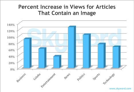
While this isn’t a new study, my guess is, the results are more true today, not less. I’m talking about a 2011 study by Skyword, which shows that including images in your content leads to significantly more views.
In particular:
- Content containing related images performed better across all content categories, in all months tested
- On average, total views increased by 94% if a published article contained a relevant photograph or infographic, as compared to articles without an image in the same category
- Certain categories, like news, politics, and sports, benefit more than others, such as entertainment, where image libraries are frequently duplicated across the web
- Search optimizing image captions and metadata further enhance performance
Notice the stat in the second bullet. Articles with relevant images get 94% more views than articles without images. That’s almost double.
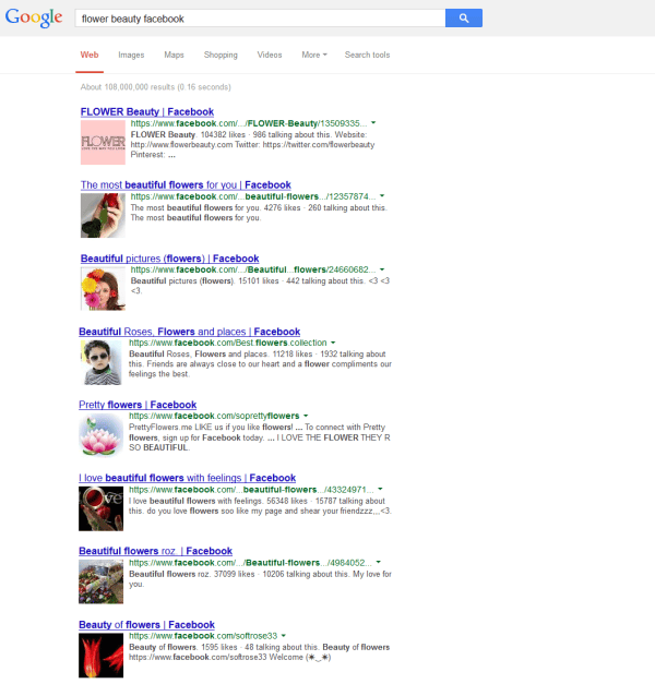
Now pair that with a Google update I saw last week from Search Engine Land. Apparently, Google is testing the inclusion of images in search results. The screenshot below is from the SEL article and shows what Google is testing: an image from each of the Web pages listed.
Not everything Google tests will make it into their algorithms, it’s true. But based on this test, it’s safe to assume Google considers images an important element in high-quality content.
High-quality content needs images
If you’re creating quick content just so you can say you have it, you’re probably not going to like this. But let’s be honest. Any marketing effort that engages readers and generates traffic takes time to create. That includes relevant, useful content.
Gone are the days when content was written solely for the sake of ranking in search engines. Today, you’re not going to win any awards for writing keyword-based content or even quantities of content. Only for writing great content.
And apparently, images are critical to taking your content from meh to marvelous.
So let’s look at some options for how you’re going to use images—especially now that we know you need them.
Adopt a style that suits your strategy
As always, we need to start with strategy. There are multiple ways to use media—you simply need to pick one so your website has a holistic look and feel.
Think about what you’re trying to accomplish with your content.
- Are you a news service, updating your readers on the latest events in your industry, or a teaching blog, showing readers how to do something?
- Are you B2B or B2C?
- What do your readers expect from publishers in your industry?
Then pick a style that helps you engage readers. Here are three possible options. Pick one or mix and match.
1. Magazine Style – image as hooks
Think about the glossy magazines you see in the grocery checkout line. The cover usually features an eye-catching image designed to make you pick it up and look inside.
Now think about your blog as a magazine. Images can help you stop casual clickers and get them reading.
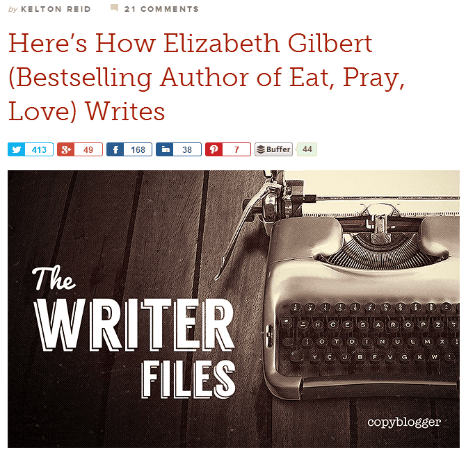
Even text-heavy brands do this. Copyblogger, for example:
The title and image take up all the above-the-fold space. You have to scroll if you want to see the first line of the article.
With this style of image usage, your headline and feature image are hooks for building curiosity and making people decide to read.
As with a magazine, if you can get that far with your readers, you pretty much have them in your hand.
2. Illustration style – illustrate your words
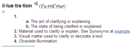
When I say “illustration,” I don’t mean the magazine-style illustration—a bold picture designed to hook your readers. Here, I mean the literal definition:
With this style of image usage, pictures are primarily to show as well as tell. If you’re telling people how to create the perfect social media post, you show them examples of posts (good and bad), so they understand what you’re talking about. If you’re giving them steps in a process, you grab screenshots that show readers what each step looks like.
This how-to article is a great example of illustration-style image usage.
And here’s one on Crazy Egg that also uses this style.
In both articles, the images and videos don’t just add interest. They help readers understand the points being made.
3. Media-as-content style – image is focus
Sometimes you aren’t using images to get people interested in your words or to help comprehension. You’re using images for their own sake.
These days, media of all types can serve as high-quality content.
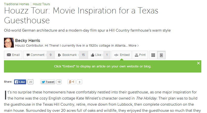
Houzz is a home decoration inspiration site. As you might guess, their blog is filled with media-as-content posts. Here, the words support the images, not the other way around.
There’s a strong title and intro.
Then the images take center-stage. The text of this article are little more than captions.
Of course, you can also use video as your centerpiece. When going this route, you may have just one video with supporting text—sometimes a transcript for SEO purposes, sometimes commentary to add value.
Here’s how Advertising Age does it:
AdAge creates a descriptive headline, features the video, then gives a short commentary.
The bottom line with images
Content is communication. So every element in your content should help tell your story.
If (hopefully) you use images, they should integrate with and support your message. They aren’t just eye candy, but neither do they need to be there just to encourage sharing or gain some Google love. They should add to the message. Otherwise, they’re a distraction.
Images should not be
- Inserted willy-nilly, just to have an image.
- Trite or overused stock photos.
- Thought of only as share-bait.
- Boring or irrelevant.
Do you make a point that’s hard to communicate with words only? Find an example and take a screenshot. Or create a graphic to show people what you mean.
Are there added dimensions to your message that you don’t have room to talk about? Perhaps you can find an image that conveys those added dimensions without having to say anything.
But whatever else you do, add images. It adds to the value of your content and keeps people engaged longer.
Thoughts? What would you add?

