Most marketers agree that the secret sauce in marketing is your list.
In years gone by, you only had to buy a list. Expensive, yes, but relatively easy. Today, with email as your primary vehicle and anti-spam laws in effect, you have to build your own list.
How? By convincing visitors to share their email address with you—when they know you’ll likely send them tons of emails and when their inboxes are already overflowing with unread emails.
This, my friends, is a challenge. Simply uploading a form won’t cut it. But, then, you probably already know that from experience.
This is where your marketing skills come into play. To build your list, you need to treat email optin as a purchase, with a valid email address as the purchase price.
Taking this approach, subscription is a product. If optins are low, you need to figure out what the problem could be and experiment with ways of driving action.
Start by looking at four elements that tend to dampen optins. Fix them, and you could see immediate improvement in your subscriber rate.
Problem 1: Too many fields
This isn’t a new concept, but some marketers still insist on gathering as much information as possible.
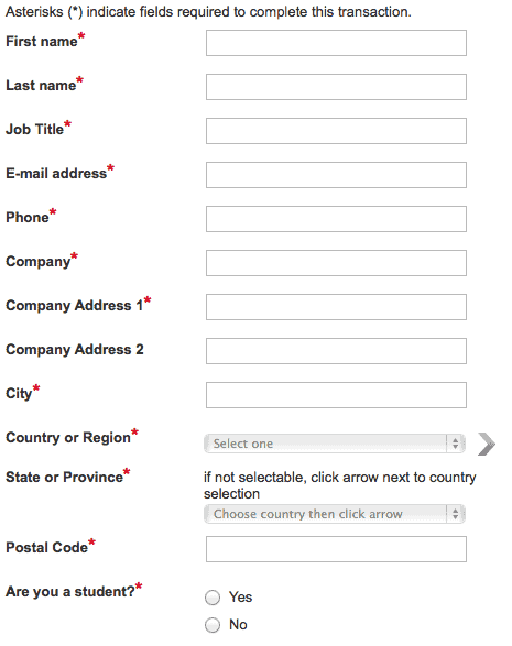
The brand that stands out in my mind is HubSpot. Yes, they’re a major marketer. That doesn’t mean they’ve always done everything right. My guess is they’ve decided to test their forms and have found they weren’t converting well, because this is what they used to look like:
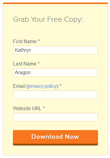
This is what they look like now:
Not only have they reduced the number of fields, they’ve also employed auto-fill, so repeat downloaders don’t have to type in their information ad nauseum.
Even so, this is still a lot of information to ask of people. Even if you use the data for lead generation, as HubSpot does, it’s important to evaluate whether all this information is necessary.
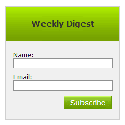
For best results, you want to ask for as little information as possible:
This only asks for name and email. But even here, you have to ask if the name is necessary. Perhaps not. ConversionXL hasn’t found it important enough to risk depressing conversions, so they only ask for subscribers’ email:
However, if you want to use personalization in your marketing, you’ll need a name. The choice is yours… and may be worth testing.
Problem 2: Too little trust
People are judicious about handing out their email address. They know it leads to an influx of (unwanted) emails. They also know there’s a chance you’ll sell or rent your list and they’ll find themselves on multiple lists they didn’t sign up for.
Here’s the thing: When people don’t trust you, they won’t respond to your offers. That doubly true for your optin offers.
To help, be sure you give full disclosure. Tell people what they’re subscribing to and what to expect once they’ve subscribed.
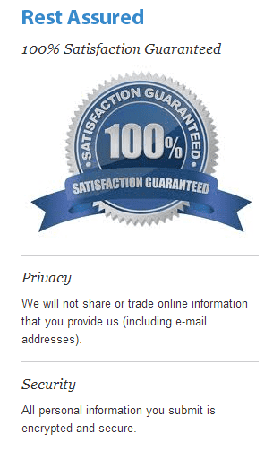
In eCommerce, you can include trust logos, like this on Digital Marketer:
When asking for subscriptions, focus on “trust statements” on your optin form.
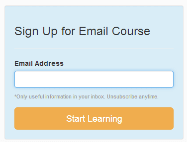
I like this one from Terminus:
See the trust statement above the button? Usually you see a “no spam” message that says something like, “We’ll never sell or rent your information.” Here, you get an “Only useful information in your inbox” message. When I first read it, I smiled. Its differentness is what makes it stand out.
Now, it’s worth mentioning that some marketers are getting better results from removing the trust statement from their optin box. But after seeing this one on Terminus, I have a hypothesis about why.
When you follow standard protocol, filling in all the blanks with standard copy, you end up with cookie-cutter marketing. Even trust-building elements, if they look like every other brands’, doesn’t say “you can trust me.” It says, “I’m not putting much thought into this,” or “I don’t know what I’m doing yet,” neither of which builds trust.
Give it some thought. Don’t copy what everyone else is doing. Let people know, in your own words, that you aren’t going to take advantage of them.
Problem 3: Glitches in technology
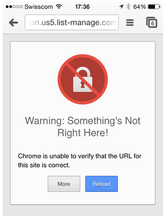
To keep your conversions high, you need to make sure your technology is working right. When people click the subscribe button, you don’t want them getting this:
Or this:
Like that’s a trust-builder!
Invest in the best technology you can afford. If you don’t know how to set it up, pay someone to do it right. When errors occur, as they will, do you best to fix them quickly.
Problem 4: You aren’t framing it right
I hate to break it to you, but nobody wants your promotions. Few people want your blog posts flooding their inbox—even your biggest fans.
That’s why you need to present the optin as a benefit. Some people do this by offering a free book or other gift. But you can get creative. Offer a 15-minute free consultation, trial run of a new app, or access to a members-only forum.
Here’s a good example. I recently signed up to receive Jeff Walker’s new book, Launch, for free. Just the day before, I had considered buying it on Amazon, so getting the book for shipping only seemed like a good deal.
Even so, I did have to think for a minute. Buying through Amazon means I’m not on his mailing list. Getting the book free means I may have to deal with a flood of promotional emails that I don’t have time to read.
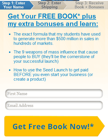
That’s why his form is so important:
Notice how well it presents the benefits of signing up.
- The book is free.
- The system it teaches has earned millions in sales. (That doesn’t incent me to buy on this website, but it’s a powerful benefit for buying the book somewhere.)
- Buying it here, I get bonuses that could add value to the book.
I decided to accept the offer.
And that, my friend, is what conversion optimization is all about. Take time to understand your audience. What makes them tick? Why incents them to act? Weave those elements into your offer, and you’ll get the action you want.


