It happens.
A link breaks on an old blog post, and the webmaster is too busy to notice. Or a URL gets typed wrong. Trouble is, people clicking on those links end up… on your 404 page.
What’s a 404 page?
It’s that page you sometimes land on that tells you the page you were looking for can’t be found. In some cases, it’s an ugly, unbranded page that simply does what it’s supposed to do.
But for smart marketers, it’s an opportunity to keep your hard-earned Web traffic on-site. If you haven’t already, you need to check out your own 404 page to be sure it re-engages people and sends them back into your website.
Let’s look at a few examples…
What not to do
404 pages are a bit like the top of the refrigerator. If you aren’t tall enough to see up there, you don’t realized how much dust you’re collecting.
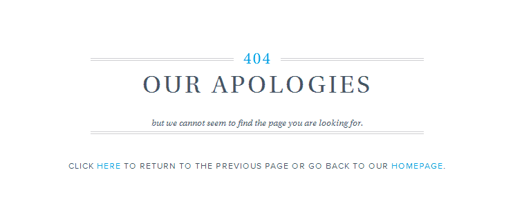
Unless you check your own 404 page, you may not know it looks like this:
Or like these, which are a little better, but not much. (At least they include a link to the Home page.)
Amazon
Warby Parker
Obviously this isn’t something brands automatically get right. After all, if Amazon can miss the boat, it’s safe to assume we will too.
So what does a good 404 page look like? Let’s take a tour.
The right way to design a 404 page
Moz.com
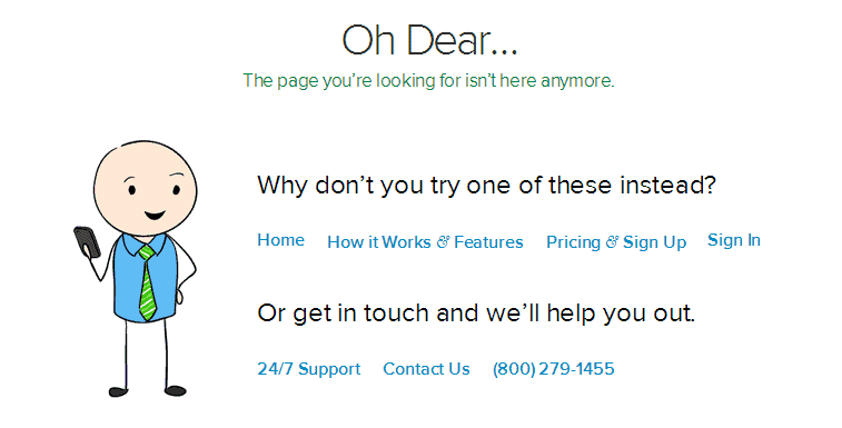
I like this one because it does everything right. You get an apology, a few sample links, a search bar, and links to the Home and Support pages. It also includes a cute graphic of their mascot. If you need a template for your 404 page, this is a good one.
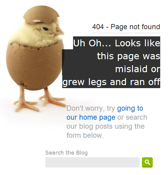
Crazy Egg’s blog, The Daily Egg
Crazy Egg’s brand is the egg, obviously. So a chick popping out of the egg is cute. I like the fun, conversational style of this message and its usefulness. It includes a link Home and a search bar, so users can find the page they’re looking for.
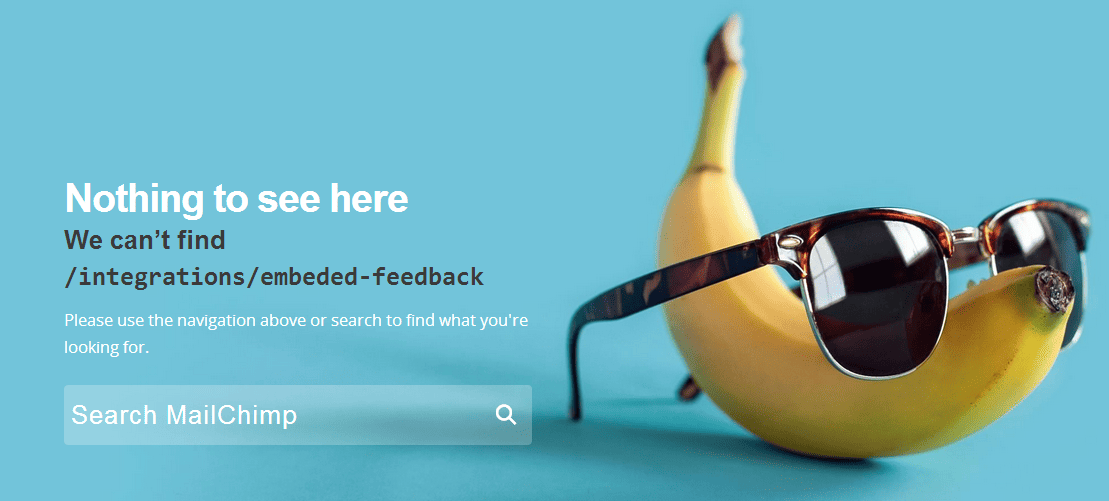
MailChimp
Like Crazy Egg and the chick, MailChimp uses the banana to create a tie to the brand. “Nothing to see here,” picks up the brand’s typical voice and style, which is fun-loving and engaging.
Though short, this page lets people know the link is bad and provides a search bar for getting back into the site.
I will say, though, I’m surprised they don’t include a link to the Home page or other key pages. They obviously took time to design a branded page. Why didn’t they include a few links?
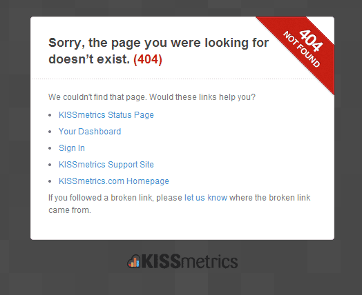
KISSmetrics
Don’t feel very creative? That’s okay. As you can see, a simple message, attractively laid out can do the job. KISSmetrics apologizes then offers a few links, including a link to the contact page. Nice.
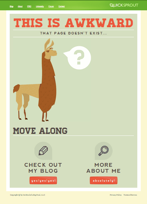
QuickSprout
I love this approach. The “this is awkward” and “move along” messaging almost makes you laugh out loud. And though there isn’t a link to the Home page, there are links to the blog and the About page.
Check out the wording on the buttons: “yes! yes! yes!” and “absolutely.” You can have fun with your 404 page—and build your brand at the same time.
AmericanAirlines
Talk about branding. So what if the link is broken… your visitors know they’re in the general vicinity with this much branding on the page.
There’s an image of a missed flight that goes perfectly with the message that the page has “taken flight.” But it doesn’t stop there: “A world of possibilities” is a few clicks away.
Then look at the anchor text for the two links. Not plain “search” and “home.” No. They invite you to “search for a flight” and return to “our home page.” It’s as if you’re talking to a flight attendant on that plane you just missed.
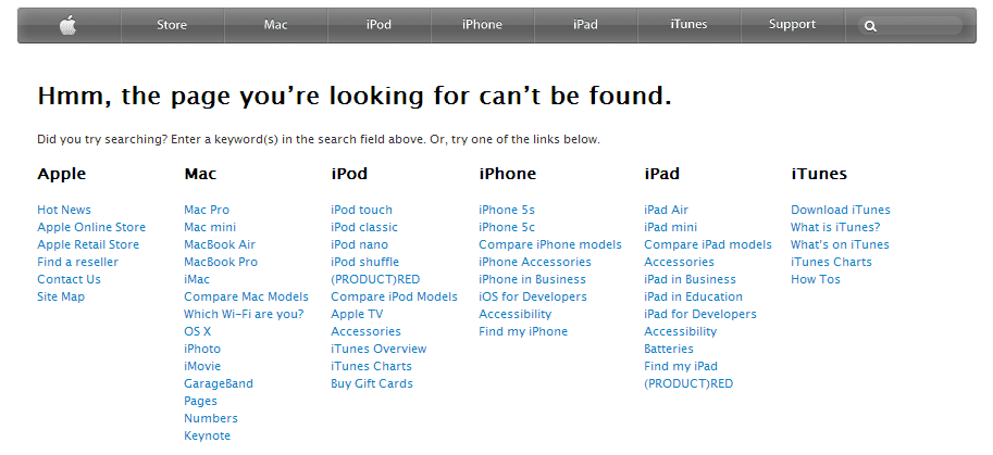
Apple
Apple’s page is a bit of a disappointment—especially following American’s 404 page. As creative as Apple’s marketing usually is, I expected a really cool presentation here. But they still get props for have a conversational tone (Hmm…) and providing lots of links to internal pages.
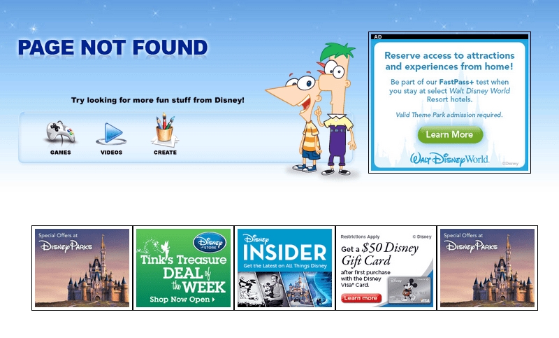
Disney
Disney does a little better. The “page not found” message is a bit curt, but at least you have some things to look at. Surrounding the cartoon figures are links to key pages and an ad. There are also thumbnail images below, linking to offers.
It looks good, I know. But I have a problem with this page. It’s not user friendly at all. In reality, it’s a page full of ads, which comes off as a bit spammy.
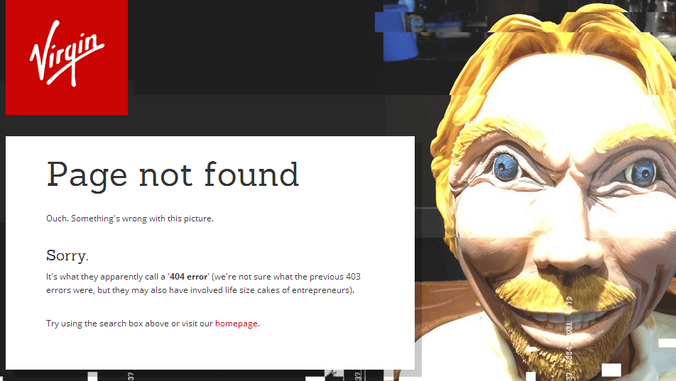
Virgin
Virgin stays true to its brand with this page, even if the image is a bit over the top. The messaging is conversational, and they give you several options for finding the page you’re looking for.
Seriously, though, they need to change the graphic.
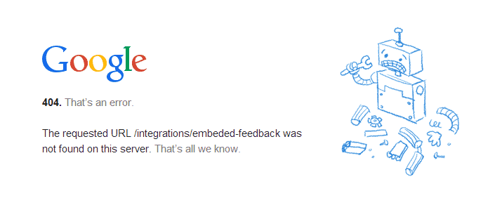
Google’s page follows the standard template: conversational messaging on the left, cute graphic on the right. But look at the tone. A little geeky and awkward, but it’s Google, after all.
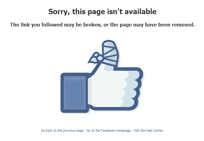
The bandage on Facebook’s iconic thumbs-up image is a great way to handle its 404 page. As you can see, simple works just fine. You have the apology and explanation at top. Three possible links are below.
Travelocity
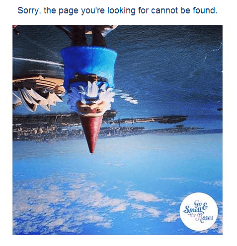 This is one of my favorites. Don’t just use your mascot. Do something fun with it. By turning the gnome upside down, Travelocity made me laugh. My only issue? Where are the links?
Hubspot
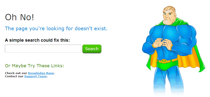
I’m sure by now, you recognize the template. Messaging on the left, image on the right. It’s fine to use this same pattern for your own page. Just make sure your messaging uses your brand’s voice and style.
One thing I like about this page: the bullets. No one wants to spend time on a 404 page. By using bullets, you make it easy for people to find the link that’s right for them.
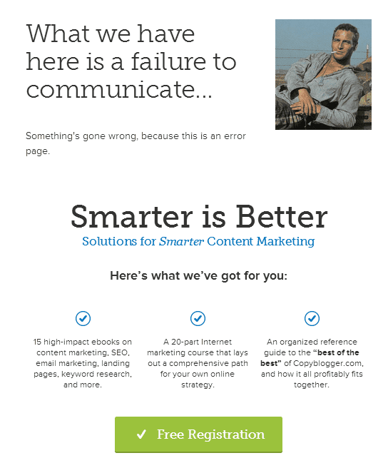
Copyblogger
Same pattern here. I really like the use of a recognizable movie quote (with image). But I wish they offered some links back to key pages. Instead, they make an offer.
That’s okay, I guess. (Disney does it.) But it’s a distraction for people who are looking for a specific page on your site.
Skype
No images? No problem. Be liberal with your personality, and you’ll do just fine. Besides, links are the most important part of your 404 page, and Skype does it well here.
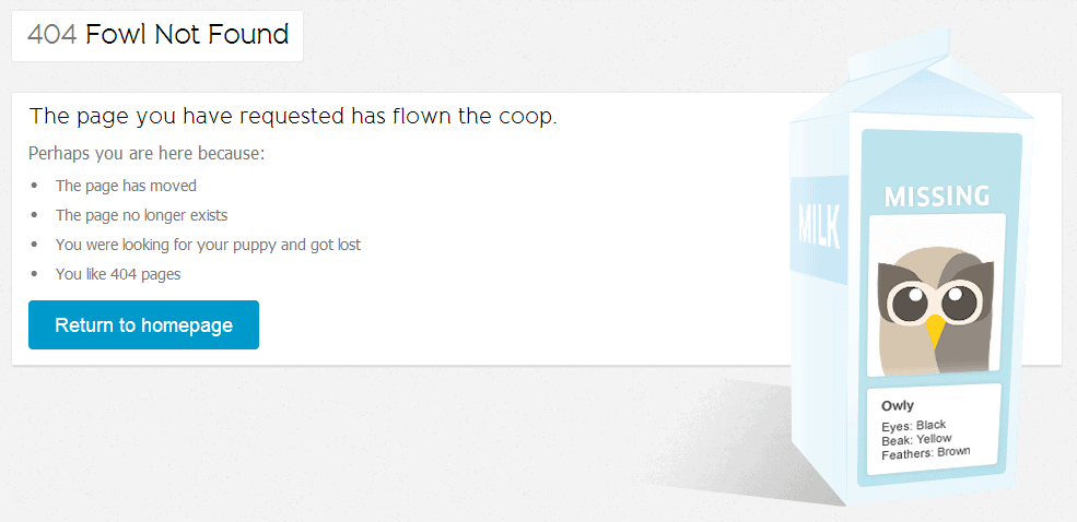
HootSuite
If you can do a little word play, go for it. This follows the standard template for a 404 page and offers a bulleted list of reasons why you ended up here. I’d prefer the bullets to be links back into the site, but with the button linking to the Home page, all is well.
AWeber
Having included MailChimp above, it seemed only fair to check out AWeber too. By now, you know the pattern. And as you can see here, you don’t need to break too far from expectations. Offer a few links, a search and a fun image, and you’re good.
Grasshopper
Grasshopper shakes things up by putting the image on the left. I do love their style. Notice how simply this is laid out. You have four links and three points of contact, and it all fits neatly beside the graphic. I like it.
Mashable
I had to include this one. Bad news/good news is a refreshing way to approach the 404 page. And there’s a search bar, so it works.
Firepole Marketing
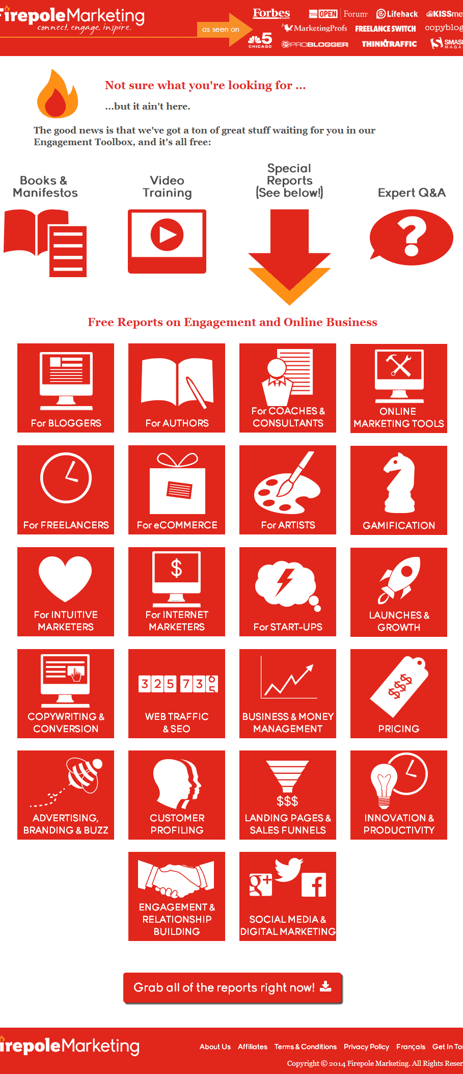
I have to say, of all the examples I found, this is the smartest. Firepole Marketing turned their 404 page into a virtual sales page—without becoming self-serving. Now that’s a feat!
You get your standard messaging at the top. Then, not settling for a few links into the website, they provide a catalog of choices. Well done, Firepole Marketing! I like it.
So what have we learned?
Good 404 pages include:
- An apology of sorts. It can be simple and direct or humorous.
- Links to key pages on your website. The Home page is a must. Other key pages are helpful.
- Possibly a search bar to help people find what they were looking for.
- Contact information, in case none of the other options fill the need.
Ideally, it will also include elements from your brand, such as your mascot or your brand’s characteristic voice.
It can be short and to the point or lengthy, like Firepole Marketing’s. But however you decide to approach it, have fun with it. Aim to put a smile on your visitors’ face. Aim to be helpful, not self-serving.
But do put some energy into your 404 page. There’s no better way to re-engage your visitors when they’ve lost their way.

