Google rewards it. Web experts recommend it. Users have no patience for sites without it.
What is it?
Usability. Now that the world is primarily digital, your website must be easy to use.
And fortunately, it’s not that hard to achieve.
You don’t have to learn code or get a degree in computer science. To keep people on your website longer and encourage them to return often, all you have to do is implement six simple changes.
1. Make your navigation simpler
Visitors should be able to find what they’re looking for in as few clicks as possible.
Experts used to recommend three clicks max, but in reality, it isn’t the number of clicks that matter. It’s that you should have an intuitive website that’s easy to navigate.
People shouldn’t have to think. They should be able to glance at your page and understand what’s going on.
That’s especially true for your navigation.
- Simple is best. So organize your information into silos, or categories.
- Use terms your visitors would use, not the experts.
- Create a landing page for each category of information. Link from there to specific details.
See how simply Tim Ash does it on his site, SiteTuners. The navigation bar has just six tabs: home, about us, large business services, small business services, free stuff, and blog.
There’s more, of course, but it’s in the footer, so it doesn’t create confusion for first-time visitors. Between the header and the footer, it’s a no-brainer to navigate this website.
2. Give people more than one way to get where they’re going
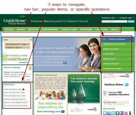
Not all people look for information in the same way. Some start with your navigation bar to see how your website is organized.
Others have a question they want answered or a specific topic they want information about.
Still others just want to browse.
By providing different ways of finding the information on your website, you make it easier for people to find information — no matter how they approach it.
Take this website, for example:
All these links go to the same pages, but they allow people to get there from different starting points.
3. Write for all readers
Most people don’t read. At least not when we’re searching the Web. On the Internet, we’re scanners.
So it’s important to present information for scanners as well as readers:
- Include images, graphs and charts.
- Organize your information in small sections with descriptive subheads.
- Use bullets to present lists in a way that’s easy to scan.
4. Cut your copy in half, then cut it some more
I’m a believer in long copy. But there’s a difference between sales copy, where you need to address all objections, and your website, where you simply need to get to the point.
No one has time to read a dissertation on every page of your website. So pare it down:
- Get to the point.
- Have just one purpose for each page.
- State it as concisely as possible.
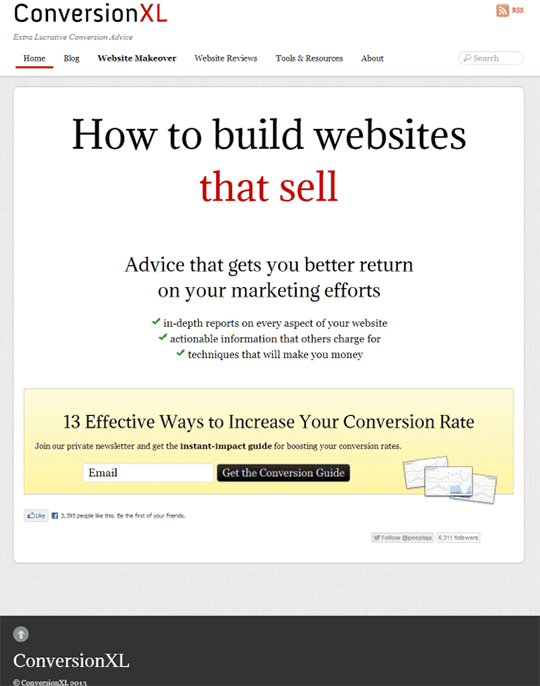
For example, your home page could simply state your core message and make an opt-in offer for your newsletter. Like this one by Peep Laja:
See what I mean? If the words are right, you only need a few.
5. Think like your visitors.
People arrive at your website looking for a particular piece of information or asking, “Am I in the right place?”
That’s why it’s so important to get to the point.
People surf the Web with their mouse hovering over the Back button. So you have only a second or two to assure people that they’re in the right place.
Take a moment to view each page of your website as if you were a first-time visitor.
- Is it attractive?
- Is it well-organized?
- Is important information easy to find?
For instance, my son and I were looking at universities the other day. On one site, it took us 10 minutes to find a page that described the business degree plan. That’s too long.
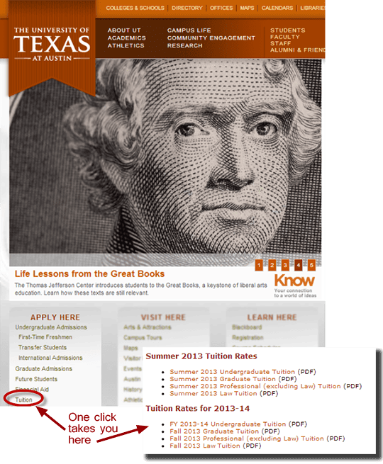
On another, we had to hunt to find tuition costs. Think about that. Every prospective student wants to know how much it costs to go to that school. So tuition costs should be a visible link, with the information easily accessible.
Of the ones we’ve looked at, University of Texas is the only one to get it right:
6. Make it accessible
Today, nearly half of your visitors are viewing your pages on a mobile device. Are they easy to read? Have you taken a mobile-first approach to building your pages?
Don’t wait until your traffic drops off. Start now making your website usable on any device:
- Make your buttons bigger.
- Rather than listing links in a bulleted list, put space between them, so they’re easy to hit when clicked on mobile phones.
It’s not brain surgery
Making your website easier to use is a no-brainer. It doesn’t take high-level skills or advanced training. And it does improve people’s perception of your brand.
All you have to do is reframe the way you think about your website.
Think of it as a storefront.
- It should be inviting and attractive.
- People should know what your business is about without having to think about it.
- And they should be able to find what they’re looking for without hunting.
Approach it from that perspective, and usability will be brain-dead simple.


