As digital marketing matures, it seems that words alone are not be enough to engage (and convert) your visitors.
If you have any resistance to that idea, think Facebook, Pinterest, and Mashable.
In the last few months, I’ve reviewed countless websites to understand why they work — especially when they break from the norm and incorporate new design or copywriting trends.
What I’ve found are four landing page trends that can transform your pages from ordinary to outstanding without having to radically change your creative process.
Let’s take a look…
Modular design
This is probably the most important trend I’m seeing. Instead of your landing page consisting of a single flow of text, it relies on short, screen-sized modules, each with its own compelling message.
HP’s landing page for the Slate7 is a great example of this.
The top module is the portion you usually think of as “above the fold.” But notice that when you scroll down, you don’t have a page that flows on and on with no break.
Instead, you have a series of screen-sized modules that stack on top of one another. So when you scroll, you move to another “screen.”
Now, with viewers using multiple devices with all different sizes of screens, this can be a challenge to design. But I think the idea can work.
Simply design landscaped modules with a sales message in each. Keep text away from the edges so it’s still legible if you are using a narrower device. Then make your images responsive.
A few tips:
Here’s a good resource to learn more about responsive images.
To test how well a page looks in different devices, load it in The Responsinator’s testing tool. Simply enter your URL to see how your page loads on a variety of mobile devices. This helps you know exactly what mobile visitors see, in both portrait and landscape views, so you know how to edit your pages for better user experience.
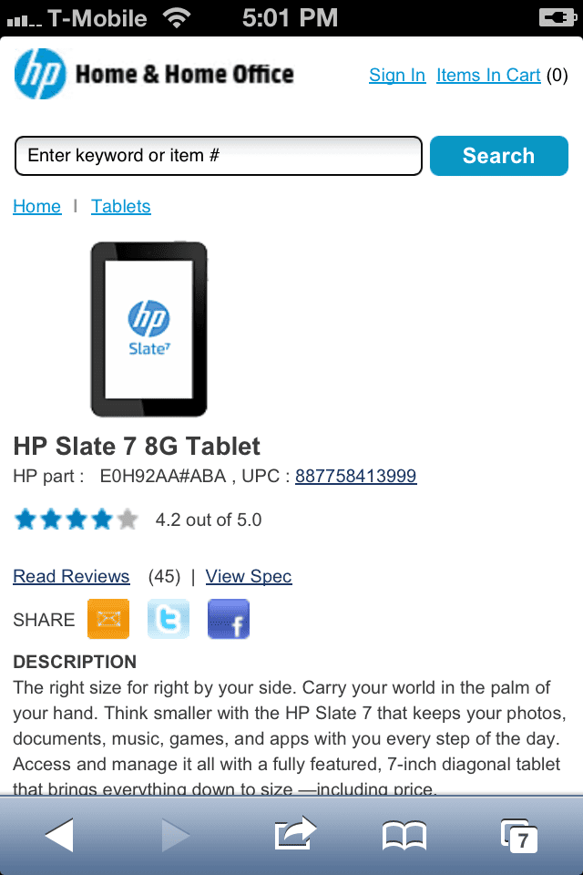
Of course, you can just do what HP does, and create simple text pages for mobile. I couldn’t find the above sales page on my iPhone. Instead, here’s what I got:
Lots of white space
Neil Patel’s personal website, NeilPatel.com, is a traditional long-form sales page — but not. Because it groups text around images to tell the story visually as well as with words. (It’s changed since the writing of this article, but at present, it’s still a modular design that works as a long-form sales page.)
Of course, this is just a portion of the page. But it gives you a good idea of how it’s laid out.
You have modules, like the HP page above. But these modules have a white background, so you have lots of breathing space between sections.
This keeps you from going into information overload… in spite of the amount of messaging you’re presented here.
Basically, empty space around objects and/or modules is called white space. It isn’t always white, but that’s the trend these days. Why?
- White space around an object makes that object a focal point, so it stands out.
- It makes it easier for people to read your text.
- Weirdly, it builds trust, because it doesn’t appear that you’re hiding anything.
Long form doesn’t mean lots of copy
Our third trend is also a time saver, and that is to use graphics to tell part of the story, so you don’t need as many words.
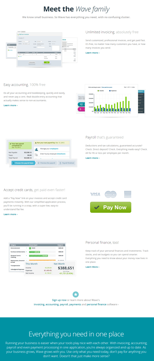
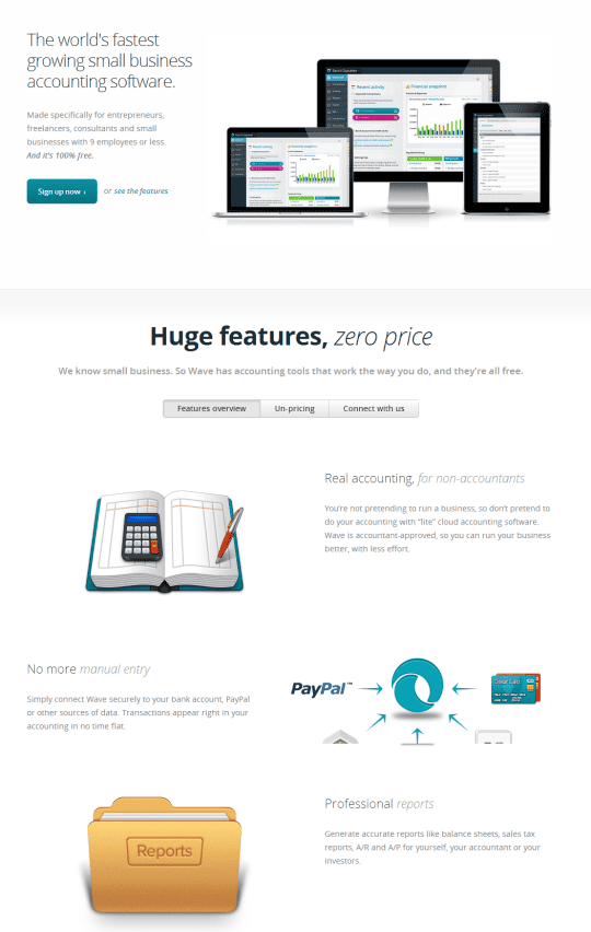
Take this landing page by Wave Apps.
See how it uses modules, one stacked on top of the other like HP. But each contains an image with a short piece of text.
To add interest, the graphic is on the right in one module and on the left in the next, alternating sides in each module.
Also notice that there’s only a subhead and a benefit statement in each block of text. If you want to learn more, you click through to a second-tier page.
But even then, Wave Apps doesn’t resort to text overload. The second-tier pages give you the information you need in bite-sized chunks, laid out in the save attractive modules you saw on the main landing page.
The truth is, people don’t read much anymore. They just don’t have time. So anything you can do to improve comprehension without a lot of words can help your readers get the information they need in less time.
And if you think about it, it makes your job easier. You don’t need pages and pages of text. With a few well-chosen, well-placed words, you may be able to get the same (or better) results.
Personally, I love this style of landing page. You can use icons as images or big, bold photographs to add a graphic element. But either way, you end up with a page that’s as attractive as it is information, so people want to stay longer.
Social proof
Graphics aren’t your only time-saving device. Used right, social proof elements can help you build trust very quickly.
For instance, Mind Valley places its Facebook numbers just under the headline of its sales page:
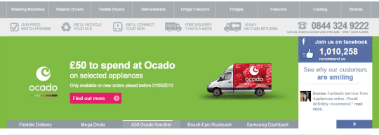
UK’s Appliances Online puts a Facebook widget in the banner of its website.
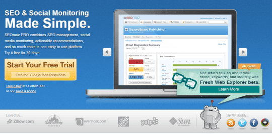
And Moz puts the logos of big-name clients under the banner on its home page (which acts as a sales page as well).
Testimonials, numbers of followers (especially if some of those followers are their friends), and a well-developed client list all can help people trust you without having to invest too much thought into the decision.
And that’s the goal.
In the words of Steve Krug, “Don’t make me think”
If you think about it, all of these trends are a nod to this concept of better usability. People are busy. They don’t have time to pay close attention to your website design or read a huge block of text.
To be honest, I’m an avid reader, and I don’t read every word in a sales page. If I’m interested, I want to know the price. Then I want to be sure it will work for me. That’s it.
You’re probably the same. (And so are your customers.)
So there’s value in incorporating these ideas into your own landing pages — if not to replace long copy, at least to make your copy easier to read.
Thoughts? Do you like these trends? Or do they raise new challenges? Let me know in the comments below.
